We do not have any built-in function to create Pie chart in seaborn, but with the help of Matplotlib, we can create a pie chart and leverage seaborn for color pallets.
A pie chart (or a circle chart) is a circular statistical graphic, which is divided into slices to illustrate numerical proportion. In this article, let us take a look at creating a pie chart using Matplotlib and Seaborn with examples.
Create a simple Pie chart in Seaborn
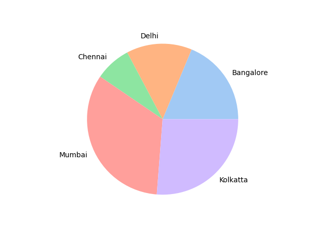
Let’s say we need to plot a pie chart for sales delivery of cars sold in different locations.
The Pie chart below demonstrates the proportion of numerical sales data for different locations. We represent the sales data in the form of slices to understand it easily.
In the below example, we have used Matplotlib to draw a pie chart, and we are using a pastel color pallet of seaborn.
The seaborn color_palette() method accepts the color pallet in the string format, and it has a wide variety of color pallets such as dark, bright, pastel, Paired etc.
import matplotlib.pyplot as plt
import seaborn as sns

# car sales data
total_sales = [3000, 2245, 1235, 5330, 4200]

location = ['Bangalore', 'Delhi', 'Chennai', 'Mumbai', 'Kolkatta']

# Seaborn color palette to plot pie chart
colors = sns.color_palette('pastel')

# create pie chart using matplotlib
plt.pie(total_sales, labels=location, colors=colors)
plt.show()
Output
 Simple Pie chart in Seaborn
Create an advanced Pie chart in Seaborn
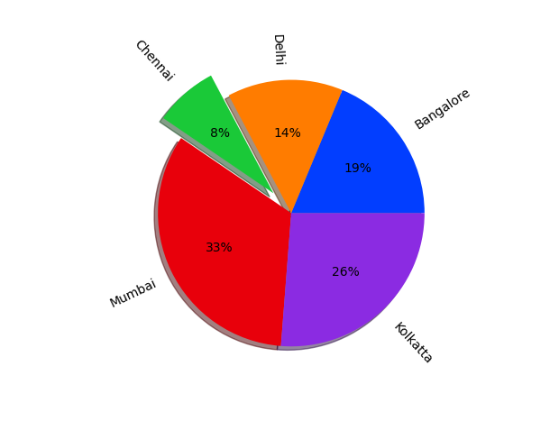
Now that we know how to create a Pie chart using Matplotlib and seaborn, let us explore the advanced features to customize the pie chart.
- We have used autopct property to set the percentage of sales inside each slice, making it more effective.
- We have the highest car sales in Mumbai. We can represent it differently by making it a standout slice using explode property.
- We can rotate the labels in the direction of the slices using the rotatelabel property.
- We have changed the color pallet to bright to make the pie chart look more attractive.
import matplotlib.pyplot as plt
import seaborn as sns

# car sales data
total_sales = [3000, 2245, 1235, 5330, 4200]
explode = [0, 0, 0, 0.2, 0]

location = ['Bangalore', 'Delhi', 'Chennai', 'Mumbai', 'Kolkatta']

# Seaborn color palette to plot pie chart
colors = sns.color_palette('bright')

# create pie chart using matplotlib
plt.pie(total_sales, labels=location, colors=colors,
        autopct='%.0f%%', explode=explode, shadow=True, rotatelabels='true')
plt.show()
Output
 Advanced Pie chart in Seaborn
from Planet Python
via read more

No comments:
Post a Comment