Introduction
Matplotlib is one of the most widely used data visualization libraries in Python. From simple to complex visualizations, it's the go-to library for most.
In this tutorial, we'll take a look at how to plot multiple line plots in Matplotlib - on the same Axes or Figure.
If you'd like to read more about plotting line plots in general, as well as customizing them, make sure to read our guide on Plotting Lines Plots with Matplotlib.
Plot Multiple Line Plots in Matplotlib
Depending on the style you're using, OOP or MATLAB-style, you'll either use the plt instance, or the ax instance to plot, with the same approach.
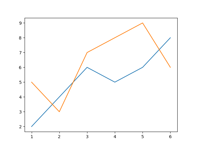
To plot multiple line plots in Matplotlib, you simply repeatedly call the plot() function, which will apply the changes to the same Figure object:
import matplotlib.pyplot as plt

x = [1, 2, 3, 4, 5, 6]
y = [2, 4, 6, 5, 6, 8]
y2 = [5, 3, 7, 8, 9, 6]

fig, ax = plt.subplots()

ax.plot(x, y)
ax.plot(x, y2)
plt.show()
Without setting any customization flags, the default colormap will apply, drawing both line plots on the same Figure object, and adjusting the color to differentiate between them:
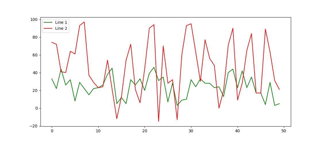
Now, let's generate some random sequences using Numpy, and customize the line plots a tiny bit by setting a specific color for each, and labeling them:
import matplotlib.pyplot as plt
import numpy as np

line_1 = np.random.randint(low = 0, high = 50, size = 50)
line_2 = np.random.randint(low = -15, high = 100, size = 50)

fig, ax = plt.subplots()

ax.plot(line_1, color = 'green', label = 'Line 1')
ax.plot(line_2, color = 'red', label = 'Line 2')
ax.legend(loc = 'upper left')
plt.show()
We don't have to supply the X-axis values to a line plot, in which case, the values from 0..n will be applied, where n is the last element in the data you're plotting. In our case, we've got two sequences of data - line_1 and line_2, which will both be plotted on the same X-axis.
While plotting, we've assigned colors to them, using the color argument, and labels for the legend, using the label argument. This results in:
Plot Multiple Line Plots with Different Scales
Sometimes, you might have two datasets, fit for line plots, but their values are significantly different, making it hard to compare both lines. For example, if line_1 had an exponentially increasing sequence of numbers, while line_2 had a linearly increasing sequence - surely and quickly enough, line_1 would have values so much larger than line_2, that the latter fades out of view.
Let's use Numpy to make an exponentially increasing sequence of numbers, and plot it next to another line on the same Axes, linearly:
import matplotlib.pyplot as plt
import numpy as np

linear_sequence = np.linspace(0, 10, 10)
# [0, 1.1, 2.2, 3.3, 4.4, 5.5, 6.6, 7.7, 8.8, 10]
exponential_sequence = np.exp(linear_sequence)
# [1.00e+00, 3.03e+00, 9.22e+00, 2.80e+01, 8.51e+01, 2.58e+02, 7.85e+02, 2.38e+03, 7.25e+03, 2.20e+04]

fig, ax = plt.subplots()

ax.plot(linear_sequence)
ax.plot(exponential_sequence)
plt.show()
Running this code results in:
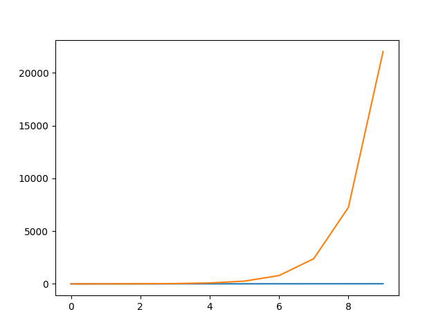
The exponential growth in the exponential_sequence goes out of proportion very fast, and it looks like there's absolutely no difference in the linear_sequence, since it's so minuscule relative to the exponential trend of the other sequence.
Now, let's plot the exponential_sequence on a logarithmic scale, which will produce a visually straight line, since the Y-scale will exponentially increase. If we plot it on a logarithmic scale, and the linear_sequence just increases by the same constant, we'll have two overlapping lines and we will only be able to see the one plotted after the first.
Let's change up the linear_sequence a bit to make it observable once we plot both:
import matplotlib.pyplot as plt
import numpy as np

# Sequences
linear_sequence = [1, 2, 3, 4, 5, 6, 7, 10, 15, 20]
exponential_sequence = np.exp(np.linspace(0, 10, 10))

fig, ax = plt.subplots()

# Plot linear sequence, and set tick labels to the same color
ax.plot(linear_sequence, color='red')
ax.tick_params(axis='y', labelcolor='red')

# Generate a new Axes instance, on the twin-X axes (same position)
ax2 = ax.twinx()

# Plot exponential sequence, set scale to logarithmic and change tick color
ax2.plot(exponential_sequence, color='green')
ax2.set_yscale('log')
ax2.tick_params(axis='y', labelcolor='green')

plt.show()
This time around, we'll have to use the OOP interface, since we're creating a new Axes instance. One Axes has one scale, so we create a new one, in the same position as the first one, and set its scale to a logarithmic one, and plot the exponential sequence.
This results in:
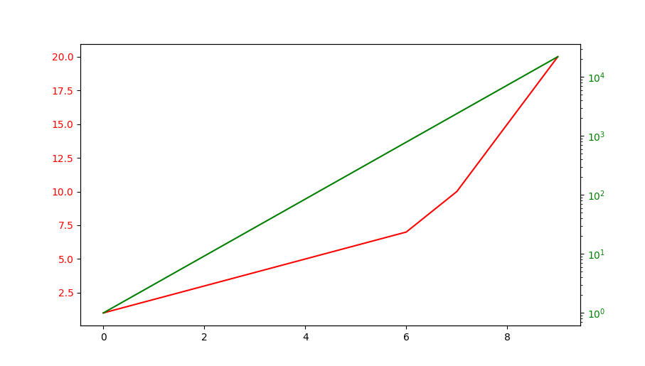
We've also changed the tick label colors to match the color of the line plots themselves, otherwise, it'd be hard to distinguish which line is on which scale.
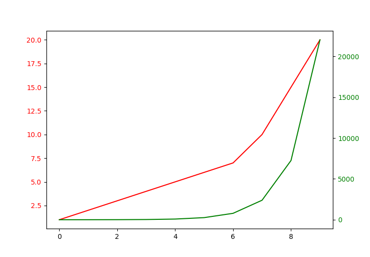
Plot Multiple Line Plots with Multiple Y-Axis
Finally, we can apply the same scale (linear, logarithmic, etc), but have different values on the Y-axis of each line plot. This is achieved through having multiple Y-axis, on different Axes objects, in the same position.
For example, the linear_sequence won't go above 20 on the Y-axis, while the exponential_sequence will go up to 20000. We can plot them both linearly, simply by plotting them on different Axes objects, in the same position, each of which set the Y-axis ticks automatically to accommodate for the data we're feeding in:
import matplotlib.pyplot as plt
import numpy as np

# Sequences
linear_sequence = [1, 2, 3, 4, 5, 6, 7, 10, 15, 20]
exponential_sequence = np.exp(np.linspace(0, 10, 10))

fig, ax = plt.subplots()

# Plot linear sequence, and set tick labels to the same color
ax.plot(linear_sequence, color='red')
ax.tick_params(axis='y', labelcolor='red')

# Generate a new Axes instance, on the twin-X axes (same position)
ax2 = ax.twinx()

# Plot exponential sequence, set scale to logarithmic and change tick color
ax2.plot(exponential_sequence, color='green')
ax2.tick_params(axis='y', labelcolor='green')

plt.show()
We've again, created another Axes in the same position as the first one, so we can plot on the same place in the Figure but different Axes objects, which allows us to set values for each Y-axis individually.
Without setting the Y-scale to logarithmic this time, both will be plotted linearly:
Conclusion
In this tutorial, we've gone over how to plot multiple Line Plots on the same Figure or Axes in Matplotlib and Python. We've covered how to plot on the same Axes with the same scale and Y-axis, as well as how to plot on the same Figure with different and identical Y-axis scales.
If you're interested in Data Visualization and don't know where to start, make sure to check out our book on Data Visualization in Python.
Data Visualization in Python, a book for beginner to intermediate Python developers, will guide you through simple data manipulation with Pandas, cover core plotting libraries like Matplotlib and Seaborn, and show you how to take advantage of declarative and experimental libraries like Altair.

from Planet Python
via read more


No comments:
Post a Comment