Introduction
There are many data visualization libraries in Python, yet Matplotlib is the most popular library out of all of them. Matplotlib’s popularity is due to its reliability and utility - it's able to create both simple and complex plots with little code. You can also customize the plots in a variety of ways.
In this tutorial, we'll cover how to plot a Pie Chart in Matplotlib.
Pie charts represent data broken down into categories/labels. They're an intuitive and simple way to visualize proportional data - such as percentages.
Plot a Pie Chart in Matplotlib
To plot a pie chart in Matplotlib, we can call the pie() function of the PyPlot or Axes instance.
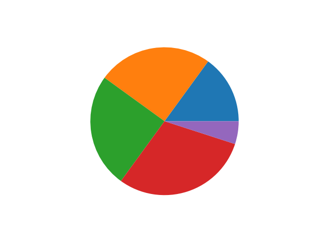
The only mandatory argument is the data we'd like to plot, such as a feature from a dataset:
import matplotlib.pyplot as plt

x = [15, 25, 25, 30, 5]

fig, ax = plt.subplots()
ax.plot(x)
plt.show()
This generates a rather simple, but plain, Pie Chart with each value being assigned to a proportionally large slice of the pie:
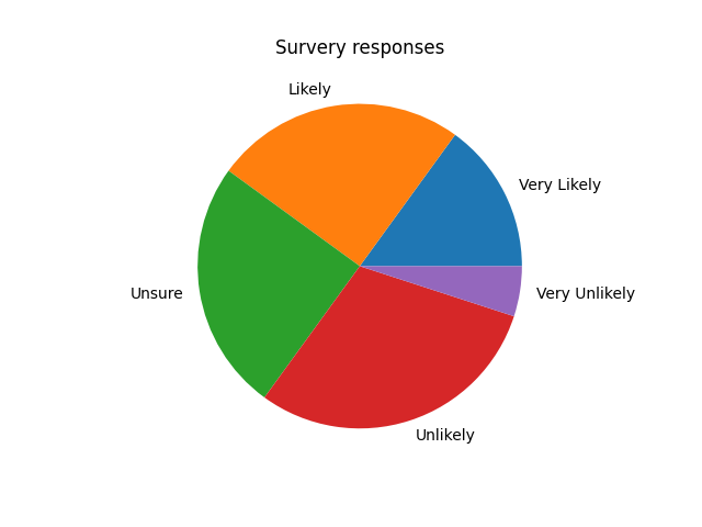
Let's add some labels, so that it's easier to distinguish what's what here:
import matplotlib.pyplot as plt

x = [15, 25, 25, 30, 5]
labels = ['Very Likely', 'Likely', 'Unsure', 'Unlikely', 'Very Unlikely']

fig, ax = plt.subplots()
ax.pie(x, labels = labels)
ax.set_title('Survery responses')
plt.show()
Now, the Pie Chart will have some additional data that allows us to interpret it a bit easier:
Customizing Pie Charts in Matplotlib
When preparing data visualizations for presentations, papers or simply to share them around with your peers - you might want to stylize and customize them a little bit, such as using different colors, that correlate to the categories, showing percentages on slices, instead of just relying on the visual perception, or exploding slices to highlight them.
Let's take a look at how Matplotlib lets us customize Pie Charts.
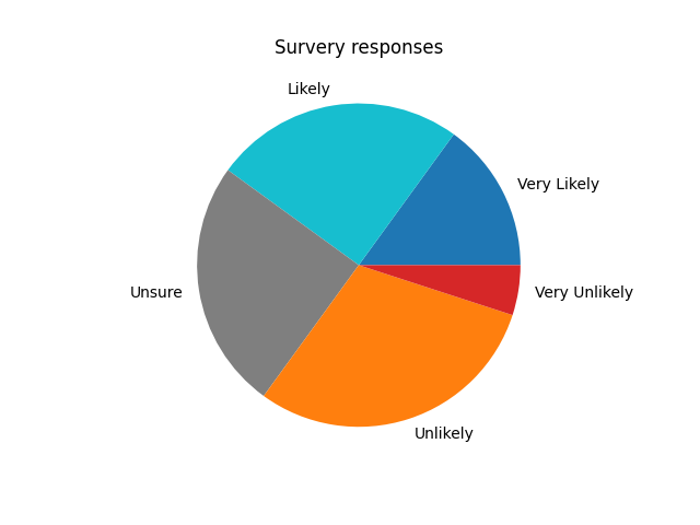
Change Pie Chart Colors
To change the colors of a Pie Chart in Matplotlib, we'll need to supply an array of colors to the colors argument, while plotting it:
import matplotlib.pyplot as plt

x = [15, 25, 25, 30, 5]
labels = ['Very Likely', 'Likely', 'Unsure', 'Unlikely', 'Very Unlikely']
colors = ['tab:blue', 'tab:cyan', 'tab:gray', 'tab:orange', 'tab:red']

fig, ax = plt.subplots()
ax.pie(x, labels = labels, colors = colors)
ax.set_title('Survery responses')
plt.show()
Here, we've created a really simple correlation between the responses and the colors they're assigned. Very Likely will be blue in the Tableau Palette, while Very Unlikely will be red.
Running this code results in:
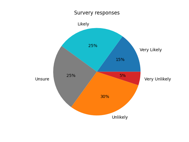
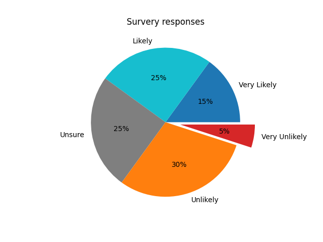
Show Percentages on Slices
Looking at the Pie Chart we've made so far, it's clear that there are more Unsure and Likely respondents than other categories individually. Though, it's oftentimes easier for us to both interpret a Pie Chart visually, and numerically.
To add numerical percentages to each slice, we use the autopct argument. It automatically sets the percentages in each wedge/slice, and accepts the standard Python string formatting notation:
import matplotlib.pyplot as plt

x = [15, 25, 25, 30, 5]
labels = ['Very Likely', 'Likely', 'Unsure', 'Unlikely', 'Very Unlikely']
colors = ['tab:blue', 'tab:cyan', 'tab:gray', 'tab:orange', 'tab:red']

fig, ax = plt.subplots()
ax.pie(x, labels = labels, colors = colors, autopct='%.0f%%')
ax.set_title('Survery responses')
plt.show()
By setting autopct to %.0f%%, we've chosen to format the percentages with 0 decimal places (only whole numbers), and added a % sign at the end. If we had omitted the surrounding %..% symbols, the strings wouldn't be formatted as percentages, but as literal values.
Running this code results in:
Explode/Highlight Wedges
Sometimes, it's important to highlight certain entries. For example, in our survey, a really small percentage of the respondents feel like the advent of something in question is Very Unlikely. Assuming that we'd want to point out the fact that most people don't think it's unlikely, we can explode the wedge:
import matplotlib.pyplot as plt

x = [15, 25, 25, 30, 5]
labels = ['Very Likely', 'Likely', 'Unsure', 'Unlikely', 'Very Unlikely']
colors = ['tab:blue', 'tab:cyan', 'tab:gray', 'tab:orange', 'tab:red']
explode = [0, 0, 0, 0, 0.2]

fig, ax = plt.subplots()
ax.pie(x, labels = labels, colors = colors, autopct='%.0f%%', explode = explode)
ax.set_title('Survery responses')
plt.show()
The explode argument accepts an array of values, from 0..1, where the values themselves define how further away the wedge is from the center. By default, all wedges have an explode value of 0, so they're all connected to the center.
Setting this value to 1 would offset it by a lot, relative to the chart, so usually, you'll explode wedges by 0.1, 0.2, 0.3, and similar values. You can explode as many of them as you'd like, with different values to highlight different categories.
Running this code results in:
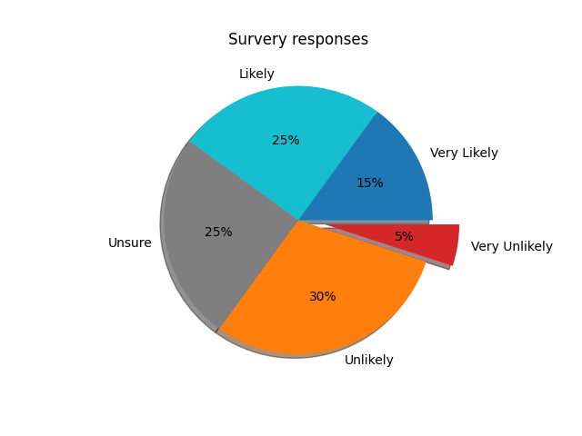
Adding a Shadow
To add a shadow to a Matplotlib pie chart, all you have to do is set the shadow argument to True:
import matplotlib.pyplot as plt

x = [15, 25, 25, 30, 5]
labels = ['Very Likely', 'Likely', 'Unsure', 'Unlikely', 'Very Unlikely']
colors = ['tab:blue', 'tab:cyan', 'tab:gray', 'tab:orange', 'tab:red']
explode = [0, 0, 0, 0, 0.2]

fig, ax = plt.subplots()
ax.pie(x, labels = labels,
          colors = colors,
          autopct='%.0f%%',
          explode = explode,
          shadow = True)

ax.set_title('Survery responses')
plt.show()
This results in:
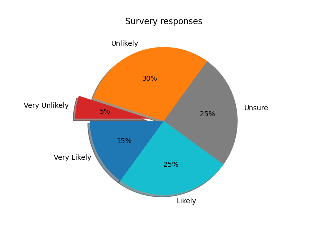
Rotating Pie Chart
Finally, you can also rotate the chart, by setting the starting angle. So far, it starts on 0 degrees (right-hand), and populated wedges counter-clockwise. By setting the startangle argument to a number between 0..360, you can make a full circle:
import matplotlib.pyplot as plt

x = [15, 25, 25, 30, 5]
labels = ['Very Likely', 'Likely', 'Unsure', 'Unlikely', 'Very Unlikely']
colors = ['tab:blue', 'tab:cyan', 'tab:gray', 'tab:orange', 'tab:red']
explode = [0, 0, 0, 0, 0.2]

fig, ax = plt.subplots()
ax.pie(x, labels = labels,
          colors = colors,
          autopct='%.0f%%',
          explode = explode,
          shadow = True,
          startangle = 180)

ax.set_title('Survery responses')
plt.show()
This results in a Pie Chart, rotated by 180 degrees, effectively flipping it to the other side:
Conclusion
In this tutorial, we've gone over how to plot simple Pie Chart in Matplotlib with Python. We've gone over simple Pie Charts, and then dived into how to customize them both for aesthetic and practical uses.
If you're interested in Data Visualization and don't know where to start, make sure to check out our book on Data Visualization in Python.
Data Visualization in Python, a book for beginner to intermediate Python developers, will guide you through simple data manipulation with Pandas, cover core plotting libraries like Matplotlib and Seaborn, and show you how to take advantage of declarative and experimental libraries like Altair.

from Planet Python
via read more


No comments:
Post a Comment