Time Series Analysis Using ARIMA From Statsmodels
ARIMA and exponential Moving averages are two methods for forecasting based on time series data. In this notebook, I will talk about ARIMA which is an acronym for Autoregressive Integrated Moving Averages.
Autoregressive Integrated Moving Averages (ARIMA)
The general process for ARIMA models is the following:
- Visualize the Time Series Data
- Make the time series data stationary
- Plot the Correlation and AutoCorrelation Charts
- Construct the ARIMA Model or Seasonal ARIMA based on the data
- Use the model to make predictions
Let's go through these steps!
Monthly Champagne Sales Data
import numpy as np
import pandas as pd

import matplotlib.pyplot as plt
%matplotlib inline
For this example, I took the sales data which is available on kaggle https://ift.tt/3sDiIi5
df=pd.read_csv('perrin-freres-monthly-champagne-.csv')
df.head()
df.tail()
## Cleaning up the data
df.columns=["Month","Sales"]
df.head()
Our objective is to forecast the champagne sales.
## Drop last 2 rows
df.drop(106,axis=0,inplace=True)
Axis=0, means row. Learn more about dropping rows or columns in Pandas here
df.tail()
df.drop(105,axis=0,inplace=True)
df.tail()
# Convert Month into Datetime
df['Month']=pd.to_datetime(df['Month'])
df.head()
df.set_index('Month',inplace=True)
df.head()
df.describe()
df.plot()
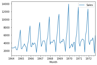
Stationary data means data which has no trend with respect to the time.
### Testing For Stationarity
from statsmodels.tsa.stattools import adfuller
test_result=adfuller(df['Sales'])
#Ho: It is non stationary
#H1: It is stationary

def adfuller_test(sales):
    result=adfuller(sales)
    labels = ['ADF Test Statistic','p-value','#Lags Used','Number of Observations Used']
    for value,label in zip(result,labels):
        print(label+' : '+str(value) )
    if result[1] <= 0.05:
        print("P value is less than 0.05 that means we can reject the null hypothesis(Ho). Therefore we can conclude that data has no unit root and is stationary")
    else:
        print("Weak evidence against null hypothesis that means time series has a unit root which indicates that it is non-stationary ")
adfuller_test(df['Sales'])
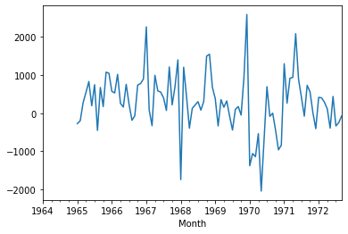
Differencing helps remove the changes from the data and make data stationary.
df['Sales First Difference'] = df['Sales'] - df['Sales'].shift(1)
df['Sales'].shift(1)
we have monthly data so let us try a shift value of 12.
df['Seasonal First Difference']=df['Sales']-df['Sales'].shift(12)
df.head(14)
Let us check if the data now is stationary.
## Again test dickey fuller test
adfuller_test(df['Seasonal First Difference'].dropna())
df['Seasonal First Difference'].plot()
from statsmodels.tsa.arima_model import ARIMA
import statsmodels.api as sm
- Partial Auto Correlation Function - Takes in to account the impact of direct variables only
- Auto Correlation Function - Takes in to account the impact of all the variables (direct + indirect)
Let us plot lags on the horizontal and the correlations on vertical axis using plot_acf and plot_pacf function.
from statsmodels.graphics.tsaplots import plot_acf,plot_pacf
fig = plt.figure(figsize=(12,8))
ax1 = fig.add_subplot(211)
fig = sm.graphics.tsa.plot_acf(df['Seasonal First Difference'].iloc[13:],lags=40,ax=ax1)
ax2 = fig.add_subplot(212)
fig = sm.graphics.tsa.plot_pacf(df['Seasonal First Difference'].iloc[13:],lags=40,ax=ax2)
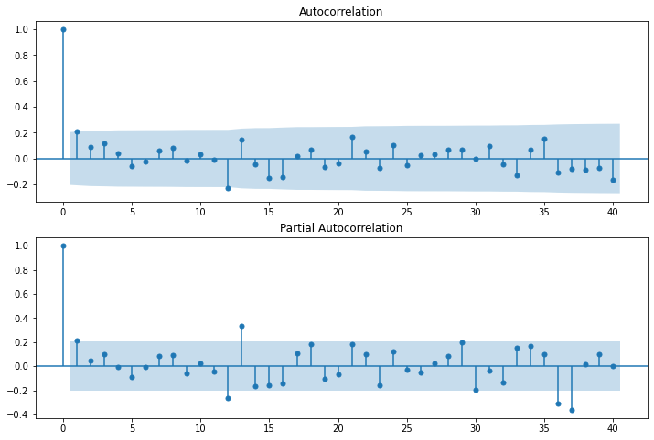
In the graphs above, each spike(lag) which is above the dashed area considers to be statistically significant.
# For non-seasonal data
#p=1 (AR specification), d=1 (Integration order), q=0 or 1 (MA specification/polynomial)
AR specification, Integration order, MA specification
from statsmodels.tsa.arima_model import ARIMA
model=ARIMA(df['Sales'],order=(1,1,1))
model_fit=model.fit()
model_fit.summary()
We can also do line and density plot of residuals.
from matplotlib import pyplot
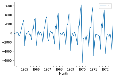
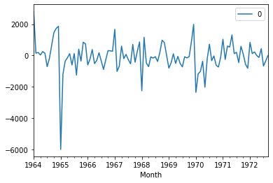
residuals = pd.DataFrame(model_fit.resid)
residuals.plot()
pyplot.show()
# density plot of residuals
residuals.plot(kind='kde')
pyplot.show()
# summary stats of residuals
print(residuals.describe())
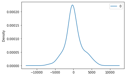
As we see above, mean is not exactly zero that means there is some bias in the data.
df['forecast']=model_fit.predict(start=90,end=103,dynamic=True)
df[['Sales','forecast']].plot(figsize=(12,8))
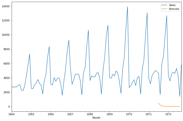
If you observe the above, we are not getting good results using ARIMA because our data has seasonal behaviour, So let us try using seasonal ARIMA.
import statsmodels.api as sm
model=sm.tsa.statespace.SARIMAX(df['Sales'],order=(1, 1, 1),seasonal_order=(1,1,1,12))
results=model.fit()
Note above the seasonal_order tuples which takes the following format (Seasonal AR specification, Seasonal Integration order, Seasonal MA, Seasonal periodicity)
results.summary()
Let us plot again line and density chart of residuals.
from matplotlib import pyplot
residuals = pd.DataFrame(results.resid)
residuals.plot()
pyplot.show()
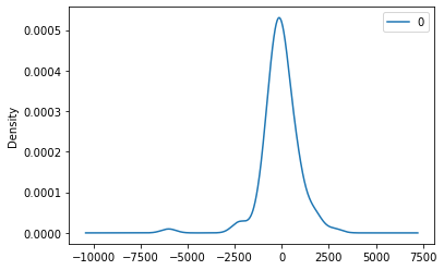
# density plot of residuals
residuals.plot(kind='kde')
pyplot.show()
# summary stats of residuals
print(residuals.describe())
df['forecast']=results.predict(start=90,end=103,dynamic=True)
df[['Sales','forecast']].plot(figsize=(12,8))
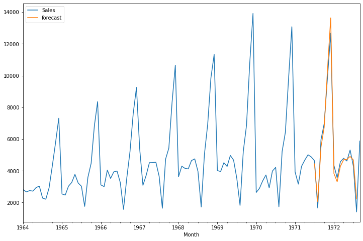
Conclusion: If you compare the ARIMA and SARIMA results, SARIMA gives good result comapre to ARIMA.
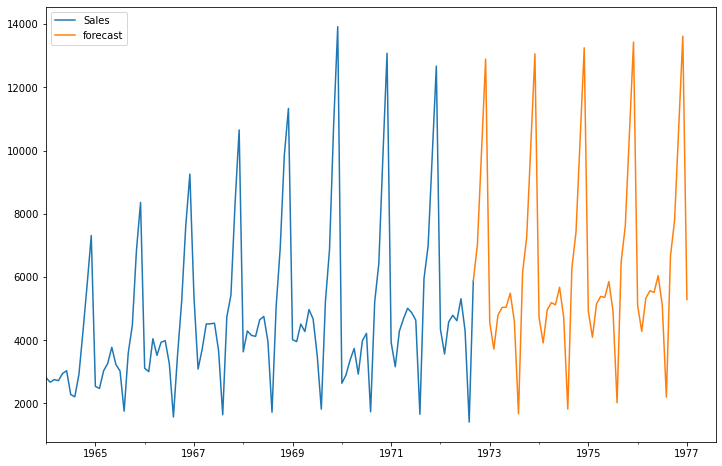
5*12
from pandas.tseries.offsets import DateOffset
future_dates=[df.index[-1]+ DateOffset(months=x)for x in range(0,60)]
future_datest_df=pd.DataFrame(index=future_dates[1:],columns=df.columns)
future_datest_df.tail()
future_df=pd.concat([df,future_datest_df])
future_df['forecast'] = results.predict(start = 104, end = 156, dynamic= True)
future_df[['Sales', 'forecast']].plot(figsize=(12, 8))
from Planet Python
via read more


No comments:
Post a Comment