The post How to Make a Violin plot in Python using Matplotlib and Seaborn appeared first on Erik Marsja.
In this Python data visualization tutorial, we are going to learn how to create a violin plot using Matplotlib and Seaborn. Now, there are several techniques for visualizing data (see the post 9 Data Visualization Techniques You Should Learn in Python for some examples) that we can carry out. Violin plots are combining both the box plot and the histogram. In the next section, you will get a brief overview of the content of this blog post.
Outline
Before we get into the details on how to create a violin plot in Python we will have a look at what is needed to follow this Python data visualization tutorial. When we have what we need, we will answer a couple of questions (e.g., learn what a violin plot is). In the following sections, we will get into the practical parts. That is, we will learn how to use 1) Matplotlib and 2) Seaborn to create a violin plot in Python.
Requirements
First of all, you need to have Python 3 installed to follow this post. Second, to use both Matplotlib and Seaborn you need to install these two excellent Python packages. Now, you can install Python packages using both Pip and conda. The later if you have Anaconda (or Miniconda) Python distribution. Note, Seaborn requires that Matplotlib is installed so if you, for example, want to try both packages to create violin plots in Python you can type pip install seaborn. This will install Seaborn and Matplotlib along with other dependencies (e.g., NumPy and SciPy). Oh, we are also going to read the example data using Pandas. Pandas can, of course, also be installed using pip.
What is a Violin Plot?
As previously mentioned, a violin plot is a data visualization technique that combines a box plot and a histogram. This type of plot therefore will show us the distribution, median, interquartile range (iqr) of data. Specifically, the iqr and median are the statistical information shown in the box plot whereas distribution is being displayed by the histogram.
What does Violin plot show?
A violin plot is showing numerical data. Specifically, it will reveal the distribution shape and summary statitisics of the numerical data. It can be used to explore data across different groups or variables in our datasets.
Example Data
In this post, we are going to work with a fake dataset. This dataset can be downloaded here and is data from a Flanker task created with OpenSesame. Of course, the experiment was never actually run to collect the current data. Here’s how we read a CSV file with Pandas:
import pandas as pd data = 'https://raw.githubusercontent.com/marsja/jupyter/master/flanks.csv' df = pd.read_csv(data, index_col=0) df.head()Code language: Python (python)
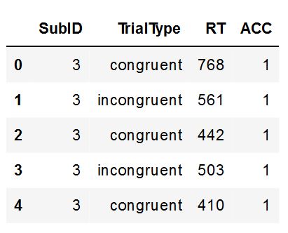 Example data
Now, we can calculate descriptive statistics in Python using Pandas describe():
df.loc[:, 'TrialType':'ACC'].groupby(by='TrialType').describe()Code language: Python (python)
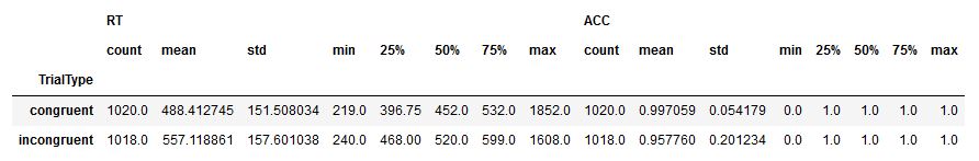 Descriptive Statistics
Now, in the code above we used loc to slice the Pandas dataframe. This as we did not want to calculate summary statistics on the SubID. Furthermore, we used Pandas groupby to group the data by condition (i.e., “TrialType”). Now that we have some data we will continue exploring the data by creating a violin plot using 1) Matplotlib and 2) Seaborn.
How to Make a Violin Plot in Python with Matplotlib
Here’s how to create a violin plot with the Python package Matplotlib:
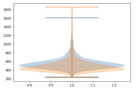
import matplotlib.pyplot as plt plt.violinplot(df['RT'])Code language: Python (python)
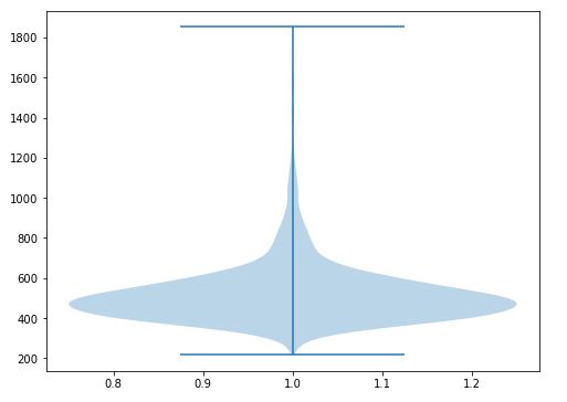 Violin plot created with Matplotlib
n the code above, we used the violinplot() method and used the dataframe as the only parameter. Furthermore, we selected only the response time (i.e. the “RT” column) using the brackets. Now, as we know there are two conditions in the dataset and, therefore, we should create one violin plot for each condition. In the next example, we are going to subset the data and create violin plots, using matplotlib, for each condition.
Grouped Violin Plot in Python with Matplotlib
One way to create a violin plot for the different conditions (grouped) is to subset the data:
# Subsetting using Pandas query(): congruent = df.query('TrialType == "congruent"')['RT'] incongruent = df.query('TrialType == "incongruent"')['RT'] fig, ax = plt.subplots() inc = ax.violinplot(incongruent) con = ax.violinplot(congruent) fig.tight_layout()Code language: Python (python)
Now we can see that there is some overlap in the distributions but they seem a bit different. Furthermore, we can see that iqr is a bit different. Especially, the tops. However, we don’t really know which color represents which. However, from the descriptive statistics earlier, we can assume that the blue one is incongruent. Note we also know this because that is the first one we created.
We can make this plot easier to read by using some more methods. In the next code chunk, we are going to create a list of the data and then add ticks labels to the plot as well as set (two) ticks to the plot.
# Combine data plot_data = list([incongruent, congruent]) fig, ax = plt.subplots() xticklabels = ['Incongruent', 'Congruent'] ax.set_xticks([1, 2]) ax.set_xticklabels(xticklabels) ax.violinplot(plot_data)Code language: Python (python)
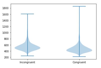
Notice how we now get the violin plots side by side instead. In the next example, we are going to add the median to the plot using the showmedians parameter.
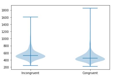
Displaying Median in the Violin Plot Created with Matplotlib
Here’s how we can show the median in the violin plots we create with the Python library matplotlib:
fig, ax = plt.subplots() xticklabels = ['Incongruent', 'Congruent'] ax.set_xticks([1, 2]) ax.set_xticklabels(xticklabels) ax.violinplot(plot_data, showmedians=True)Code language: Python (python)
In the next section, we will start working with Seaborn to create a violin plot in Python. This package is built as a wrapper to Matplotlib and is a bit easier to work with. First, we will start by creating a simple violin plot (the same as the first example using Matplotlib). Second, we will create grouped violin plots, as well.
How to Create a Violin Plot in Python with Seaborn
Here’s how we can create a violin plot in Python using Seaborn:
import seaborn as sns sns.violinplot(y='RT', data=df)Code language: JavaScript (javascript)
In the code chunk above, we imported seaborn as sns. This enables us to use a range of methods and, in this case, we created a violin plot with Seaborn. Notice how we set the first parameter to be the dependent variable and the second to be our Pandas dataframe.
Again, we know that there two conditions and, therefore, in the next example we will use the x parameter to create violin plots for each group (i.e. conditions).
Grouped Violin Plot in Python using Seaborn
To create a grouped violin plot in Python with Seaborn we can use the x parameter:
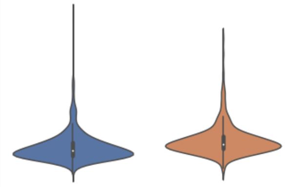
sns.violinplot(y='RT', x="TrialType", data=df)Code language: Python (python)
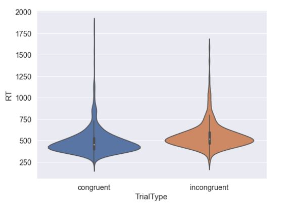 Violin Pot
Now, this violin plot is easier to read compared to the one we created using Matplotlib. We get a violin plot, for each group/condition, side by side with axis labels. All this by using a single Python metod! If we have further categories we can also use the split parameter to get KDEs for each category split. Let’s see how we do that in the next section.
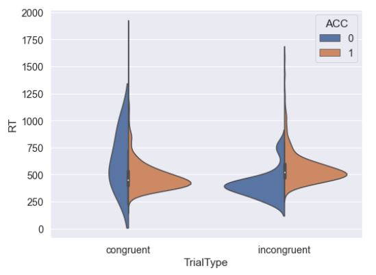
Grouped Violin Plot in Seaborn with Split Violins
Here’s how we can use the split parameter, and set it to True to get a KDE for each level of a category:
sns.violinplot(y='RT', x="TrialType", split=True, hue='ACC', data=df)Code language: Python (python)
In the next and final example, we are going to create a horizontal violin plot in Python with Seaborn and the orient parameter.
Horizontal Violin Plot in Python with Seaborn
Here’s how we use the orient parameter to get a horizontal violin plot with Seaborn:
sns.violinplot(y='TrialType', x="RT", orient='h', data=df)Code language: Python (python)
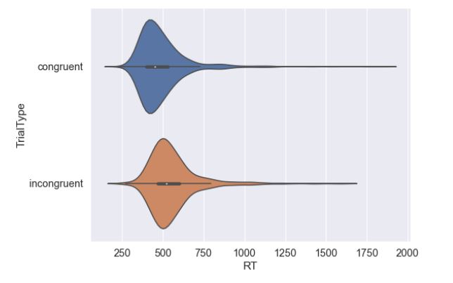 Horizontal Violin Plot
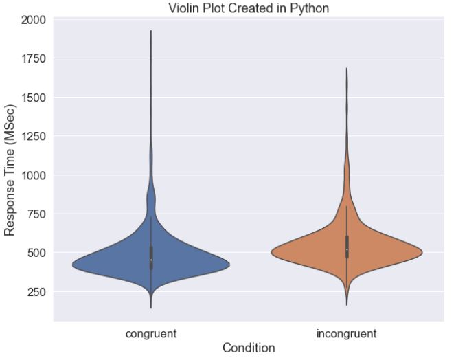
Notice how we also flipped the y and x parameters. That is, we now have the dependent variable (“RT”) as the x parameter. If we want to save a plot, whether created with Matplotlib or Seaborn, we might want to e.g. change the Seaborn plot size and add or change the title and labels. Here’s a code example customizing a Seaborn violin plot:
import seaborn as sns import matplotlib.pyplot as plt fig = plt.gcf() # Change seaborn plot size fig.set_size_inches(10, 8) # Increase font size sns.set(font_scale=1.5) # Create the violin plot sns.violinplot(y='RT', x='TrialType', data=df) # Change Axis labels: plt.xlabel('Condition') plt.ylabel('Response Time (MSec)') plt.title('Violin Plot Created in Python')Code language: Python (python)
In the above code chunk, we have a fully working example creating a violin plot in Python using Seaborn and Matplotlib. Now, we start by importing the needed packages. After that, we create a new figure with plt.gcf(). In the next code lines, we change the size of 1) the plot, and 2) the font. Now, we are creating the violin plot and, then, we change the x- and y-axis labels. Finally, the title is added to the plot.
For more data visualization tutorials:
- How to Plot a Histogram with Pandas in 3 Simple Steps
- 9 Python Data Visualization Examples (Video)
- How to Make a Scatter Plot in Python using Seaborn
- Seaborn Line Plots: A Detailed Guide with Examples (Multiple Lines)
Conclusion
In this post, you have learned how to make a violin plot in Python using the packages Matplotlib and Seaborn. First, you learned a bit about what a violin plot is and, then, how to create both single and grouped violin plots in Python with 1) Matplotlib and 2) Seaborn.

The post How to Make a Violin plot in Python using Matplotlib and Seaborn appeared first on Erik Marsja.
from Planet Python
via read more


No comments:
Post a Comment