Hello programmers, in today’s article, we will discuss the Matplotlib Pie chart in Python. A Pie Chart is a circular statistical plot used to display only one series of data. The area of the pie chart is the total percentage of the given data. The area of slices of the pie represents the percentage of the parts of the data. Pie charts are generally used in business presentations like sales, survey results, operations, etc., as they provide a quick summary. The matplotlib.pyplot.pie() function is used to plot pie charts in Python. Before we go ahead with matplotlib pie chart examples, let me briefly brief you with the same syntax and parameters.
Syntax of Matplotlib Pie Chart
matplotlib.pyplot.pie(data, explode=None, labels=None, colors=None, autopct=None, shadow=False)
Parameters:
- data: Array of data values to be plotted. The fractional area of each slice is represented by data/sum(data). If the sum(data)<1, then the data values return the fractional area directly. Thus resulting in a pie chart having an empty wedge of size 1-sum(data).
- labels: List of a sequence of strings that sets the label of each wedge.
- color: Provide color to the wedges.
- autopct: String labeling the wedge with their numerical value.
- shadow: Creates shadow of the wedge.
Return type
The matplotlib.pyplot.pie() functions return a pie chart plot in Python. The wedges of the Pie chart is returned as:
patches: A sequence/ list of patches wedge instances texts: A list of the label Text instances.
autotexts: A list of Text instances for the numeric labels. This will only be returned if the parameter autopct is None.
Example of Matplotlib Pie Chart in Python
from matplotlib import pyplot as plt
import numpy as np


# Creating dataset
cars = ['AUDI', 'BMW', 'FORD',
        'TESLA', 'JAGUAR', 'MERCEDES']

data = [23, 17, 35, 29, 12, 41]

# Creating plot
fig = plt.figure(figsize =(10, 7))
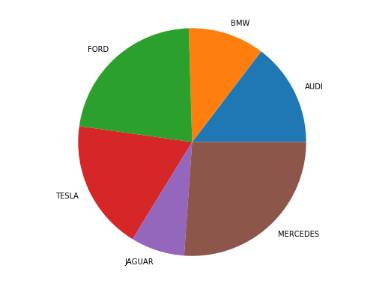
plt.pie(data, labels = cars)

# show plot
plt.show()
OUTPUT:

EXPLANATION:
The above example is a very basic python code to plot a pie chart. Firstly, the matplotlib and Numpy libraries are imported. A dataset is defined named ‘cars’. It contains the list of car names to serve as labels for the pie chart. Another array called ‘data’ is defined. It contains the data values to be plotted. The fractional area of each slice of the pie chart is represented by data/sum(data). Finally, we pass the ‘data’ and labels = ‘cars’ as arguments to the plt.pie() function. Thus returning a pie chart plot as output having the wedges as per the data values. And the labels of the wedges as per the values mentioned under ‘cars’.
Custom Pie Chart
import numpy as np
import matplotlib.pyplot as plt


# Creating dataset
cars = ['AUDI', 'BMW', 'FORD',
        'TESLA', 'JAGUAR', 'MERCEDES']

data = [23, 17, 35, 29, 12, 41]


# Creating explode data
explode = (0.1, 0.0, 0.2, 0.3, 0.0, 0.0)

# Creating color parameters
colors = ( "orange", "cyan", "brown",
          "grey", "indigo", "beige")

# Wedge properties
wp = { 'linewidth' : 1, 'edgecolor' : "green" }

# Creating autocpt arguments
def func(pct, allvalues):
    absolute = int(pct / 100.*np.sum(allvalues))
    return "{:.1f}%\n({:d} g)".format(pct, absolute)

# Creating plot
fig, ax = plt.subplots(figsize =(10, 7))
wedges, texts, autotexts = ax.pie(data,
                                  autopct = lambda pct: func(pct, data),
                                  explode = explode,
                                  labels = cars,
                                  shadow = True,
                                  colors = colors,
                                  startangle = 90,
                                  wedgeprops = wp,
                                  textprops = dict(color ="magenta"))

# Adding legend
ax.legend(wedges, cars,
          title ="Cars",
          loc ="center left",
          bbox_to_anchor =(1, 0, 0.5, 1))

plt.setp(autotexts, size = 8, weight ="bold")
ax.set_title("Customizing pie chart")

# show plot
plt.show()
OUTPUT:

EXPLANATION:
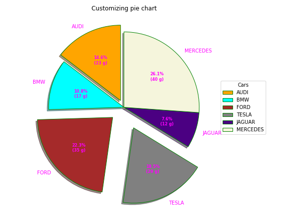
A pie chart can be customized based on various aspects. In the above example, autopct controls how the percentages are displayed on the wedges. The startangle is set to 90 degrees, which rotates the plot by 90 degrees in the counter-clockwise direction, performed on the x-axis of the pie chart. The explode attribute allows some of the wedges to stand out as per your choice. If the explode, the parameter is ‘None,’ which must be an array with one value for each wedge. Each value represents how far from the center each wedge is displayed.
The colors parameter sets the color of each wedge. It is defined as a ‘color’ array with one value for each wedge. The shadow attribute accepts a boolean value. Its value is set to true so that the shadow will appear below the rim of the pie. Wedges of the pie can be customized using wedgeprop. This wedgeprop attribute takes the Python dictionary as a parameter with name-value pairs denoting the wedge properties like linewidth, edgecolor, etc. By setting frame=True axes, the frame is drawn around the pie chart. And finally, the legend() function is used to add a list of explanations for each wedge.
Nested Matplotlib Pie chart
from matplotlib import pyplot as plt
import numpy as np


# Creating dataset
size = 6
cars = ['AUDI', 'BMW', 'FORD',
        'TESLA', 'JAGUAR', 'MERCEDES']

data = np.array([[23, 16], [17, 23],
                 [35, 11], [29, 33],
                 [12, 27], [41, 42]])

# normalizing data to 2 pi
norm = data / np.sum(data)*2 * np.pi

# obtaining ordinates of bar edges
left = np.cumsum(np.append(0,
                           norm.flatten()[:-1])).reshape(data.shape)

# Creating color scale
cmap = plt.get_cmap("tab20c")
outer_colors = cmap(np.arange(6)*4)
inner_colors = cmap(np.array([1, 2, 5, 6, 9,
                              10, 12, 13, 15,
                              17, 18, 20 ]))

# Creating plot
fig, ax = plt.subplots(figsize =(10, 7),
                       subplot_kw = dict(polar = True))

ax.bar(x = left[:, 0],
       width = norm.sum(axis = 1),
       bottom = 1-size,
       height = size,
       color = outer_colors,
       edgecolor ='w',
       linewidth = 1,
       align ="edge")

ax.bar(x = left.flatten(),
       width = norm.flatten(),
       bottom = 1-2 * size,
       height = size,
       color = inner_colors,
       edgecolor ='w',
       linewidth = 1,
       align ="edge")

ax.set(title ="Nested pie chart")
ax.set_axis_off()

# show plot
plt.show()
OUTPUT:

EXPLANATION:
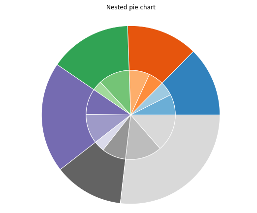
Nested pie charts are often known as donut charts. In the above example, the matplotlib nested pie chart is accomplished using a bar plot on axes with a polar coordinate system. This gives more flexibility in the design of the plot. We need to map x-values of the bar chart onto radians of a circle. The cumulative sum of the values is used as the edges of the bars.
Conclusion
In this article, we learned about the Matplotlib pie chart in Python and its Syntax and return type. We also cited examples of plotting pie chart in Matplotlib Python. Pie chart customization with several aspects like colors, shadow, explode, wedge props, etc. The nested pie chart is shown using axes.bar() function. We can also implement the Nested pie chart using the same pie() function as well. Refer to this article for any queries related to the Matlotlib Pie chart.
However, if you have any doubts or questions, do let me know in the comment section below. I will try to help you as soon as possible.
Happy Pythoning!
The post Matplotlib Pie Chart Custom and Nested in Python appeared first on Python Pool.
from Planet Python
via read more

No comments:
Post a Comment