Introduction
Matplotlib is one of the most widely used data visualization libraries in Python. Much of Matplotlib's popularity comes from its customization options - you can tweak just about any element from its hierarchy of objects.
In this tutorial, we'll take a look at how to set the axis range (xlim, ylim) in Matplotlib, to truncate or expand the view to specific limits.
Creating a Plot
Let's first create a simple plot:
import matplotlib.pyplot as plt
import numpy as np

fig, ax = plt.subplots(figsize=(12, 6))

x = np.arange(0, 10, 0.1)
y = np.sin(x)
z = np.cos(x)

ax.plot(y, color='blue', label='Sine wave')
ax.plot(z, color='black', label='Cosine wave')

plt.show()
Here, we've plotted two sine functions, starting at 0 and ending at 100 with a step of 0.1. Running this code yields:

Now, we can tweak the range of this axis, which currently goes from 0 to 100.
Setting Axis Range in Matplotlib
Now, if we'd like to truncate that view, into a smaller one or even a larger one, we can tweak the X and Y limits. These can be accessed either through the PyPlot instance, or the Axes instance.
How to Set X-Limit (xlim) in Matplotlib
Let's first set the X-limit, using both the PyPlot and Axes instances. Both of these methods accept a tuple - the left and right limits. So, for example, if we wanted to truncate the view to only show the data in the range of 25-50 on the X-axis, we'd use xlim([25, 50]):
fig, ax = plt.subplots(figsize=(12, 6))

x = np.arange(0, 10, 0.1)
y = np.sin(x)
z = np.cos(x)

ax.plot(y, color='blue', label='Sine wave')
ax.plot(z, color='black', label='Cosine wave')

plt.xlim([25, 50])
This limits the view on the X-axis to the data between 25 and 50 and results in:

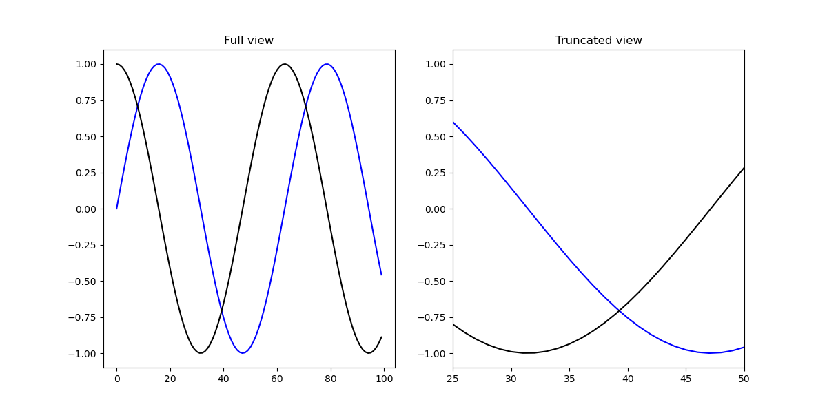
This same effect can be achieved by setting these via the ax object. This way, if we have multiple Axes, we can set the limit for them separately:
import matplotlib.pyplot as plt
import numpy as np

fig = plt.figure(figsize=(12, 6))

x = np.arange(0, 10, 0.1)
y = np.sin(x)
z = np.cos(x)

ax = fig.add_subplot(121)
ax2 = fig.add_subplot(122)

ax.set_title('Full view')
ax.plot(y, color='blue', label='Sine wave')
ax.plot(z, color='black', label='Cosine wave')

ax2.set_title('Truncated view')
ax2.plot(y, color='blue', label='Sine wave')
ax2.plot(z, color='black', label='Cosine wave')

ax2.set_xlim([25, 50])

plt.show()
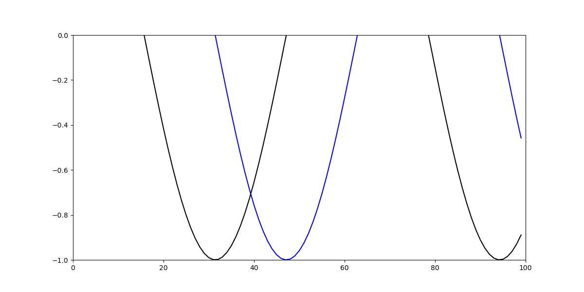
How to Set Y-Limit (ylim) in Matplotlib
Now, let's set the Y-limit. This can be achieved with the same two approaches:
ax.plot(y, color='blue', label='Sine wave')
ax.plot(z, color='black', label='Cosine wave')

plt.ylim([-1, 0])
Or:
ax.plot(y, color='blue', label='Sine wave')
ax.plot(z, color='black', label='Cosine wave')

ax.set_ylim([-1, 0])
Both of which result in:
Conclusion
In this tutorial, we've gone over how to set the axis range (i.e. the X and Y limits) using Matplotlib in Python.
If you're interested in Data Visualization and don't know where to start, make sure to check out our book on Data Visualization in Python.
Data Visualization in Python, a book for beginner to intermediate Python developers, will guide you through simple data manipulation with Pandas, cover core plotting libraries like Matplotlib and Seaborn, and show you how to take advantage of declarative and experimental libraries like Altair.

from Planet Python
via read more


No comments:
Post a Comment