Whether you’re just getting to know a dataset or preparing to publish your findings, visualization is an essential tool. Python’s popular data analysis library, pandas, provides several different options for visualizing your data with .plot(). Even if you’re at the beginning of your pandas journey, you’ll soon be creating basic plots that will yield valuable insights into your data.
In this tutorial, you’ll learn:
- What the different types of pandas plots are and when to use them
- How to get an overview of your dataset with a histogram
- How to discover correlation with a scatter plot
- How to analyze different categories and their ratios
Free Bonus: Click here to get access to a Conda cheat sheet with handy usage examples for managing your Python environment and packages.
Set Up Your Environment#
You can best follow along with the code in this tutorial in a Jupyter Notebook. This way, you’ll immediately see your plots and be able to play around with them.
You’ll also need a working Python environment including pandas. If you don’t have one yet, then you have several options:
-
If you have more ambitious plans, then download the Anaconda distribution. It’s huge (around 500 MB), but you’ll be equipped for most data science work.
-
If you prefer a minimalist setup, then check out the section on installing Miniconda in Setting Up Python for Machine Learning on Windows.
-
If you want to stick to
pip, then install the libraries discussed in this tutorial withpip install pandas matplotlib. You can also grab Jupyter Notebook withpip install jupyterlab. -
If you don’t want to do any setup, then follow along in an online Jupyter Notebook trial.
Once your environment is set up, you’re ready to download a dataset. In this tutorial, you’re going to analyze data on college majors sourced from the American Community Survey 2010–2012 Public Use Microdata Sample. It served as the basis for the Economic Guide To Picking A College Major featured on the website FiveThirtyEight.
First, download the data by passing the download URL to pandas.read_csv():
In [1]: import pandas as pd

In [2]: download_url = (
   ...:     "https://raw.githubusercontent.com/fivethirtyeight/"
   ...:     "data/master/college-majors/recent-grads.csv"
   ...: )

In [3]: df = pd.read_csv(download_url)

In [4]: type(df)
Out[4]: pandas.core.frame.DataFrame
By calling read_csv(), you create a DataFrame, which is the main data structure used in pandas.
Note: You can follow along with this tutorial even if you aren’t familiar with DataFrames. But if you’re interested in learning more about working with pandas and DataFrames, then you can check out Using Pandas and Python to Explore Your Dataset and The Pandas DataFrame: Make Working With Data Delightful.
Now that you have a DataFrame, you can take a look at the data. First, you should configure the display.max.columns option to make sure pandas doesn’t hide any columns. Then you can view the first few rows of data with .head():
In [5]: pd.set_option("display.max.columns", None)

In [6]: df.head()
You’ve just displayed the first five rows of the DataFrame df using .head(). Your output should look like this:
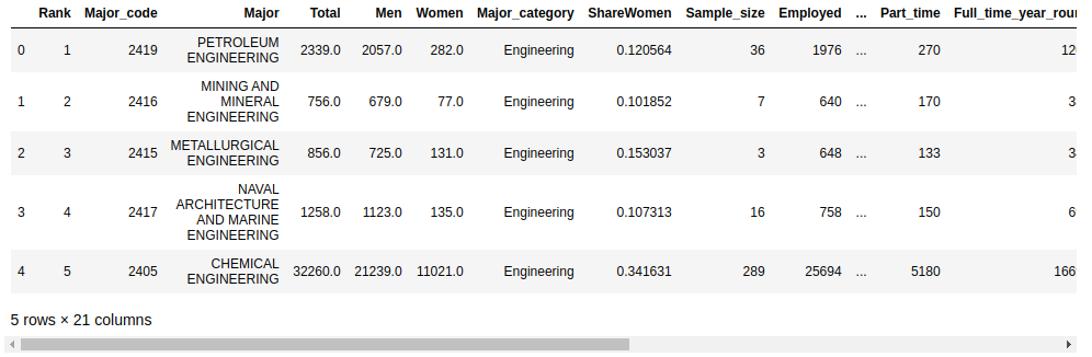
The default number of rows displayed by .head() is five, but you can specify any number of rows as an argument. For example, to display the first ten rows, you would use df.head(10).
Create Your First Pandas Plot#
Your dataset contains some columns related to the earnings of graduates in each major:
"Median"is the median earnings of full-time, year-round workers."P25th"is the 25th percentile of earnings."P75th"is the 75th percentile of earnings."Rank"is the major’s rank by median earnings.
Let’s start with a plot displaying these columns. First, you need to set up your Jupyter Notebook to display plots with the %matplotlib magic command:
In [7]: %matplotlib
Using matplotlib backend: MacOSX
The %matplotlib magic command sets up your Jupyter Notebook for displaying plots with Matplotlib. The standard Matplotlib graphics backend is used by default, and your plots will be displayed in a separate window.
Note: You can change the Matplotlib backend by passing an argument to the %matplotlib magic command.
For example, the inline backend is popular for Jupyter Notebooks because it displays the plot in the notebook itself, immediately below the cell that creates the plot:
In [7]: %matplotlib inline
There are a number of other backends available. For more information, check out the Rich Outputs tutorial in the IPython documentation.
Read the full article at https://realpython.com/pandas-plot-python/ »
[ Improve Your Python With 🐍 Python Tricks 💌 – Get a short & sweet Python Trick delivered to your inbox every couple of days. >> Click here to learn more and see examples ]
from Planet Python
via read more


No comments:
Post a Comment