Introduction
I’ve written quite a bit about visualization in python - partially because the landscape is always evolving. Plotly stands out as one of the tools that has undergone a significant amount of change since my first post in 2015. If you have not looked at using Plotly for python data visualization lately, you might want to take it for a spin. This article will discuss some of the most recent changes with Plotly, what the benefits are and why Plotly is worth considering for your data visualization needs.
Previous Observations
In 2015, I compared several of the python visualization libraries, including Plotly. At that time, I had two main concerns with Plotly:
- The library required you to setup an account and get an API key. You did not have to post your visualizations to the Plotly servers but the extra steps for the API key were a bit of an extra hurdle.
- The API was not very streamlined. It was a bit clunky and didn’t “click” with me right away.
Both of these barriers have been resolved with updates in the last year.
In March 2019, Plotly released Plotly Express. This new high-level library addressed many of the concerns I had about the pythonic nature of the Plotly API which I will discuss later in this article.
The one minor issue with Plotly Express at the initial release was that it was a a separate package from Plotly so it was an extra installation step.
Fast forward to July 2019 and Plotly 4.0 was released. This release marked two big milestones that motivated me to spend some more time with Plotly. The biggest change was that Plotly 4.0 and above would be “offline only” by default. In other words, no need for an API key. You can still use the online mode if you want to but there is a completely separate package for that.
The other big benefit of the 4.0 series is that Plotly Express was integrated back into the base Plotly package. There is no need to install an additional Plotly Express package. You can conda install or pip install Plotly and get the Plotly Express API for free.
As of this article, Plotly has continued to be improve and receive updates. I have been using it quite a bit since the 4.6 release and feel like it has reached the point where it is a a good choice for quickly building and customizing interactive visualizations.
Benefits of Plotly Express
In a recent guest post Duarte O.Carmo mentioned some of the benefits of Plotly. I echo his comments and want to expand on them with my own observations after using it for a few months.
Consistent API
When I create visualizations, I iterate through many different approaches before I find one that really works. It is important to me that I can easily switch visualization approaches with minimal code changes. The “API fit” likely varies by person but my experience is that Plotly Express fits my thought process. The Plotly Express approach is somewhat similar to seaborn. The function signature is pretty simple and powerful.
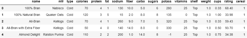
To demonstrate, we will use some cereal data that I cleaned up for clarity:
import pandas as pd
import plotly.express as px

df = pd.read_csv('https://github.com/chris1610/pbpython/blob/master/data/cereal_data.csv?raw=True')
The data contains some simple characteristics of various cereals:
If we want to look at the relationships between the rating and sugars and include the cereal name as a hover label:
fig = px.scatter(df,
                x='sugars',
                y='rating',
                hover_name='name',
                title='Cereal ratings vs. sugars')
fig.show()
&
Using this approach, it is easy to switch chart types by changing the function call. For example, it is pretty clear what each of these chart types will do:
px.scatter()px.line()px.bar()px.histogram()px.box()px.violin()px.strip()
For my work, these chart types cover 80-90% of what I do on a day to day basis.
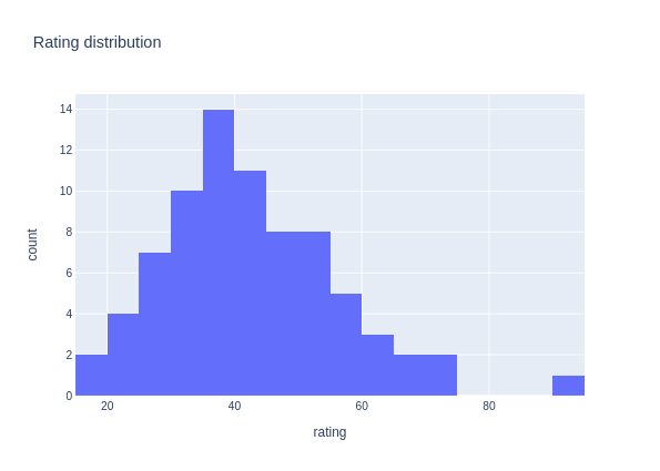
Here is another example. This time it’s a static histogram image:
fig = px.histogram(df, x='rating', title='Rating distribution')
fig.show()
In addition to the different chart types, most types support the same basic function signature so you can easily facet the data or change colors or sizes based on the values in your DataFrame:
fig = px.scatter(df,
                x='sugars',
                y='rating',
                color='mfr',
                size='calories',
                facet_row='shelf',
                facet_col='type',
                hover_name='name',
                category_orders={'shelf': ['Top', 'Middle', 'Bottom']})
fig.show()
&
Even if you have never used Plotly before, you should have a basic idea of what each of these options does and understand how useful it can be to display your data in many different ways by making minor changes to the function calls. The interactivity also makes it very easy to explorer and get a better understanding of the underlying data.
Many chart types
In addition to the basic chart types described above, Plotly has several advanced/specialized charts such as the funnel_chart, timeline, treemap, sunburst and geographic maps.
I think basic chart types should be the starting point for analysis but sometimes a more complex visualization can be really effective. It’s worth your time to check out all the options here. You never know when you might need a more specialized chart type.
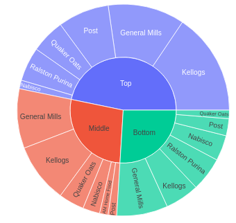
For example, a treemap can be useful for understanding the hierarchical nature of your data. This chart type is not commonly available in other python visualization libraries which is another nice positive for Plotly:
fig = px.treemap(df, path=['shelf', 'mfr'], values='cereal', title='Cereals by shelf location')
fig.show()
You can switch the concepts around and use a sunburst (don’t call me a pie) chart:
fig = px.sunburst(df, path=['mfr','shelf'], values='cereal')
fig.show()
Saving images
Suprisingly one of the challenges with many plotting libraries is that it is not easy to save static .png , .jpeg or .svg files. This is one area where matplotlib really shines and many of the javascript plotting tools struggle - especially where corporate systems are locked down & firewall settings cause problems. I have certainly done my share of taking screen shots and pasting images into a PowerPoint or email.
Plotly recently released kaleido which makes it much easier to save static images in multiple formats. The announcement goes into much more detail about the challenges of developing a stable, fast solution for exporting images. I have personally struggled with some of these same challenges. In my usage over the past couple of weeks, kaleido reliably saves high quality images as advertised. For example, saving as .svg makes for much higher quality images in my presentations.
In the examples in this article, I’ve used a mix of static .png and dynamic HTML images.
For instance, if I want to save a small version ( scale=.85 ) of the sunburst chart:
fig.write_image('sunburst.png', scale=.85)
I have been able to use this approach in a native Windows environment as well as with WSL and suspect it will work on MacOS as well. I am really glad to see this solution in place for Plotly and find it suprisingly useful for sharing results.
Plotly also supports saving as standalone HTML. For the treemap, I wanted to include the raw HTML in this static blog so I used this method to write a snippet that will serve the javascript files from a cdn and contain all the markup within a <div> tag.
fig.write_html('treemap.html',
               include_plotlyjs='cdn',
               full_html=False,
               include_mathjax='cdn')
I included the generated html my static blog post and Plotly takes care of the interactive components. Pretty nice!
Works with Pandas
When I work with data, I always end up with a pandas DataFrame and most of the time it’s in tidy format. Plotly natively understands the pandas DataFrame so you do not need additional transformation of the data prior to plotting.
Plotly can be even more integrated with pandas. Pandas 0.25 and above have an option to define different plotting back ends and Plotly can be enabled in such a fashion:
pd.options.plotting.backend = "plotly"
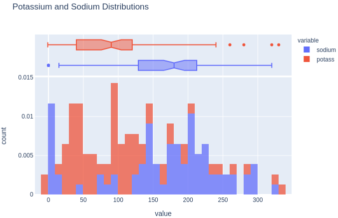
Which allows you to create a visualization using a combination of the pandas and Plotly API. Here is an example histogram using this combination:
fig = df[['sodium', 'potass']].plot(kind='hist',
                                    nbins=50,
                                    histnorm='probability density',
                                    opacity=0.75,
                                    marginal='box',
                                    title='Potassium and Sodium Distributions')
fig.write_image('potassium_sodium_plots.png')
One other recent change to plotly Express is that it supports “wide-form” as well as tidy (aka long-form) data. This feature allows you to pass multiple DataFrame columns instead of trying to melt the data into the right format. Refer to the documentation for more examples.
Figure customization
Plotly Express supports quick and straightforward modifications of visualizations. However, there are times when you need to make fine-tuned customizations. This quote from the Plotly Express intro article sums up the approach nicely:
Plotly Express is to Plotly.py what Seaborn is to matplotlib: a high-level wrapper that allows you to quickly create figures, and then use the power of the underlying API and ecosystem to make modifications afterwards.
You can customize the final Plotly Express chart using update_layout , add_shape , add_annotation add_trace or defining a template . The documentation contains many detailed examples.
Here is an example of customizing several components of the sodium and potass distribution:
fig = df[['sodium', 'potass']].plot(kind='hist',
                                    nbins=50,
                                    opacity=0.75,
                                    marginal='box',
                                    title='Potassium and Sodium Distributions')
fig.update_layout(
    title_text='Sodium and Potassium Distribution',  # title of plot
    xaxis_title_text='Grams',
    yaxis_title_text='Count',
    bargap=0.1,  # gap between bars of adjacent location coordinates
    template='simple_white', # choose from one of the pre-defined templates
)

# Can call update_layout multiple times
fig.update_layout(legend=dict(yanchor="top", y=.74, xanchor="right", x=.99))

# add a vertical "target" line
fig.add_shape(
    type='line',
    line_color='gold',
    line_width=3,
    opacity=1,
    line_dash='dot',
    x0=100,
    x1=100,
    xref='x',
    y0=0,
    y1=15,
    yref='y')

# add a text callout with arrow
fig.add_annotation(
    text='USDA Target',
    xanchor='right',
    x=100,
    y=12,
    arrowhead=1,
    showarrow=True)

fig.write_html('sodium_potassion_custom.html',
               include_plotlyjs='cdn',
               full_html=False,
               include_mathjax='cdn')
The syntax is relatively straightforward but it can take some time to work through the documentation to find the right syntax combination. This is one area where the relative youth of this package means there are not as many customization examples. I am sure this situation will improve as we get more examples in the wild.
Interactive options
By default, all of the Plotly visualizations are interactive (as demonstrated in this article). There are still times when you need to make more robust applications.
Plotly includes it’s own library called Dash that provides a lot of features and functionality for building your own custom apps. I wrote about an example in this post.
The new kid on the data apps space is Streamlit and it includes support for displaying Plotly charts using st.plotly_chart()
Here is a complete streamlit app that allows you to select which value you want to compare to the rating :
import streamlit as st
import pandas as pd
import plotly.express as px


@st.cache()
def load_data():
    df = pd.read_csv(
        'https://github.com/chris1610/pbpython/blob/master/data/cereal_data.csv?raw=True'
    )
    return df


# Read in the cereal data
df = load_data()

st.title('Rating exploration')

# Only a subset of options make sense
x_options = [
    'calories', 'protein', 'fat', 'sodium', 'fiber', 'carbo', 'sugars',
    'potass'
]

# Allow use to choose
x_axis = st.sidebar.selectbox('Which value do you want to explore?', x_options)

# plot the value
fig = px.scatter(df,
                x=x_axis,
                y='rating',
                hover_name='name',
                title=f'Cereal ratings vs. {x_axis}')

st.plotly_chart(fig)
You can run the file using:
streamlit run streamlit_example.py
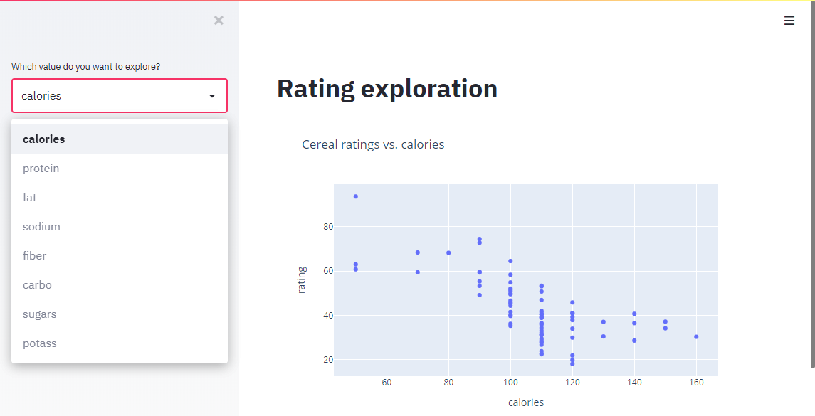
This is a simple example but shows how simple it is to create an interactive application with streamlit and Plotly.
Summary
Python’s visualization landscape continues to evolve which is good but can be difficult to keep up with. Plotly’s more recent updates, including Plotly Express and the kaleido library for image export make Plotly a good option to consider for quickly making customized, attractive and interactive data visualizations. The ability to generate high quality static images or interactive HTML versions using streamlit or Dash is a very nice bonus as well.
from Planet Python
via read more


No comments:
Post a Comment