Note: In light of the current situation, RMOTR will provide a 2 week free of charge trial period, to help people improve their programming and data management skills while staying home. Read more in this post.
COVID-19 has hit hard in the past couple of weeks and its impact has been notorious both from a sanitary perspective and an economic one. Plenty has been written about it, especially statistical reports on its exponential growth and the importance of “flattening the curve”.
At RMOTR, we wanted to help raise awareness of the issues associated with the spread of COVID-19 by making a dynamic and interactive analysis of the situation using Python and Data Science.
We’ve made an interactive project that you can fork and follow step by step. You can see the process that Data Scientists follow to analyze the situation and make predictions. Here is a quick summary.

 👉 Click this button to fork the project and follow it step by step👈
This project has been created by @yosoymatias, one of our expert Data Scientists on Staff. This is a write up of his work.
Part 1: The Basics of Exploratory Data Analysis and Data Wrangling
We’ll start with the first Notebook, Part 1.ipynb and follow the basic steps of every Data Science project.
Step 1: Reading Data
The first step is getting the data. In this case, we’re using this Github repo by Johns Hopkins University that contains CSV files updated daily.
We’re using a neat Pandas technique of reading the CSV directly from the Github repo, which means we can run our notebooks everyday and it’ll stay up to date:
COVID_CONFIRMED_URL = ‘https://raw.githubusercontent.com/CSSEGISandData/COVID-19/master/csse_covid_19_data/csse_covid_19_time_series/time_series_19-covid-Confirmed.csv'
covid_confirmed = pd.read_csv(COVID_CONFIRMED_URL)
Step 2: Data Cleaning
This is the mandatory second step of our project. Here, the data is fairly clean, so there isn’t much more to do. We’ll replace a few country names and fill in blanks.
Step 3 & 4: Analysis and Data Wrangling
In the first stage of analyzing, we’ll start with a worldwide impact analysis of COVID-19. To conduct our analysis, we’ll need to create new columns, create intermediate DataFrames, and re-shape (melt, stack, group) our data. This is usually known as the “Data Wrangling” process.
 Proportion of cases that have been active, recovered or died.
We can then plot the evolution of cases over time which shows, as we know, an alarming exponential growth:
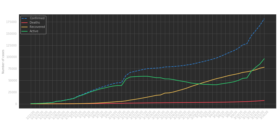 Evolution of cases as days pass
As you may know already, it’s hard to see if growth is slowing down when it’s exponential, so we’ll change our y-axis to use a logarithmic scale:
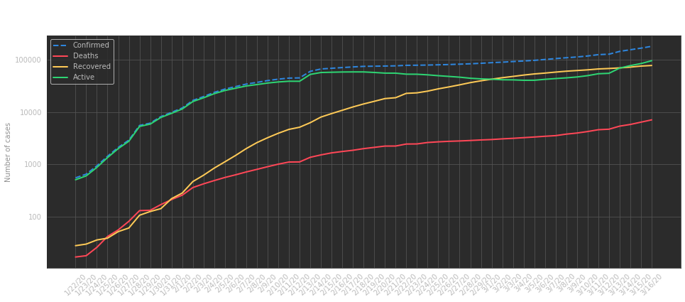 Evolution of cases, logarithmic scale
To continue our analysis, we’ll compare Recovery vs Mortality. To do that, we’ll define a few new columns with “ratio every 100 confirmed cases”.
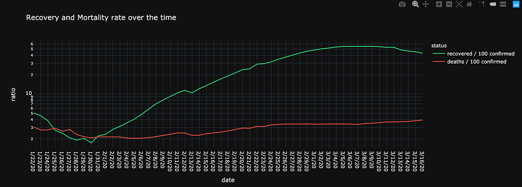
We see a more encouraging scenario where recovery has sped up and deaths are kept at a constant rate.
Evolution of COVID-19, in a Dynamic Worldwide Map
We’ll finish the first part of our analysis with an interactive map showing the evolution of COVID-19 over time. The Notebook contains a dynamic plot you can play with, which looks like this:
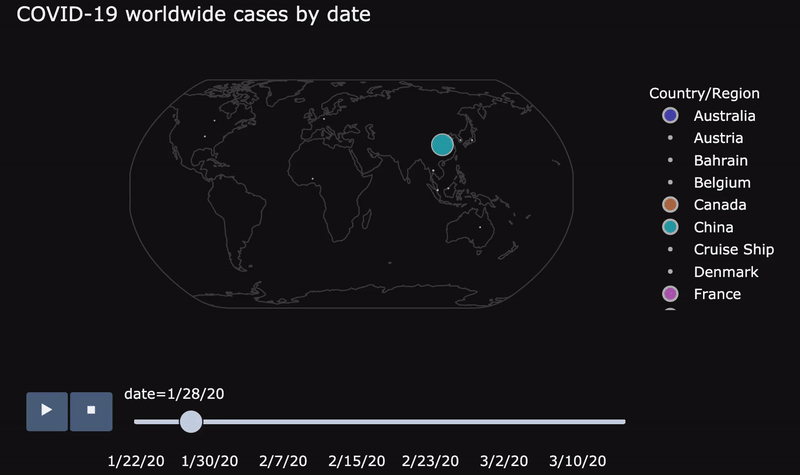 Evolution of cases in an interactive plot
Part 2: More In-depth Analysis
In this second part, we’ll dig deeper into the state of each country. Head now to Part 2.ipynb to follow the process step by step.
We’ll start again by reading the data, cleaning it, and creating a few intermediate DataFrames. You can see where this is going already. 70% of a Data Scientist’s time is spent on “Data Wrangling”.
Analysis of More Affected Countries
We know that China and Italy top the number of cases, as shown in the following charts:
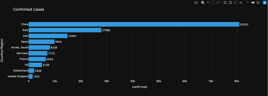 Total of confirmed cases per country
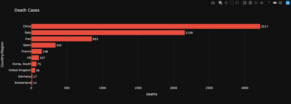 Deaths per country
But can we go deeper? Our role as Data Scientists is to keep pushing past the surface of the data. The number of cases (confirmed, deaths, recovered) per country is publicly known. However, we can go further and create our own derived analysis. For example “mortality per country”, which now shows a different perspective:
 Mortality per coutnry
Finally, let’s take a look at the evolution of cases in these countries, in logarithmic scale (you can find a linear scale in the notebook):
 Evolution per country, logarithmic scale
<INSERT YOUR COUNTRY> Analysis
The beauty of “programmatic” analysis is that you can change one variable and have a dynamic analysis. For the sake of this post, I’ll use the USA, but you can spin Part 2.ipynb and try with whatever country you call home.
First, we see a worrying “developing state” where there are a lot of “confirmed” cases but less certainty about recovery:
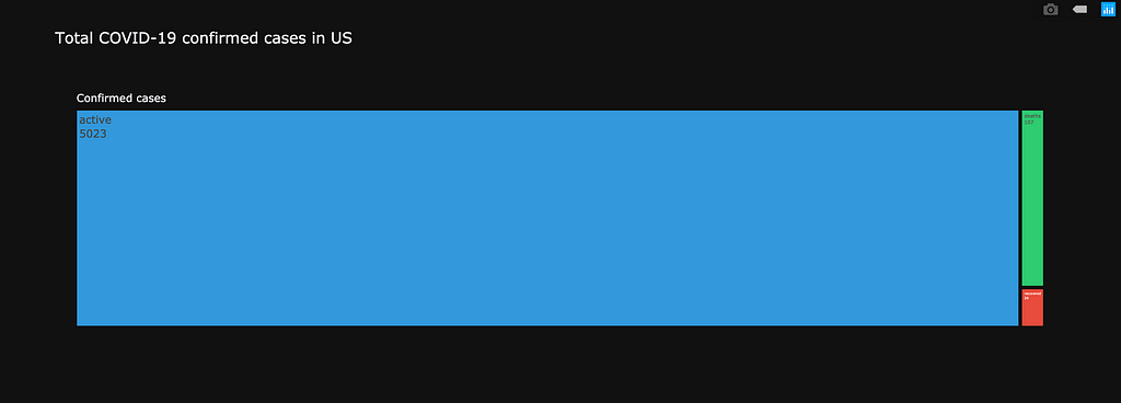 Total cases in the USA (green is recovered, red is deaths)
We can extend it per state:
 COVID-19 cases per US State.
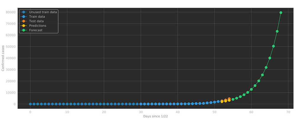
Part 3: Forecasting the Evolution of COVID-19
The last part of our project, Part 3.ipynb shows how to implement a simple Linear Regression model to predict the evolution of COVID-19.

The trick to making this regression work understanding that this is not an actual linear process, but an exponential one. We must treat our data accordingly. We can change the y-axis to display our predictions in a linear scale:
Final thoughts
We can’t say much about the accuracy of our predictions for COVID-19, as there are still many unknowns. There are several drugs and vaccines being tested as we write this piece and social isolation seems to be having an impact.
Our objective with this post is to help you understand the process followed by Data Scientists and the structure of a real Data Science project, regarding a very real, current situation.
Hopefully, we’ll soon look back at this analysis and find that our predictions were extremely off and COVID-19 has immensely slowed down. Even better, it remains a memory, or a demo Data Science project.
Stay Focused
If you’d like to use your social distancing time at home to continue exploring Data Science and Python Programming, RMOTR is now offering 2 weeks of use for free.
All new and current users can utilize any course within the platform. To access the content, you must create a free account and then subscribe for the free trial. You may cancel at any time.
Recommendations
If you’re planning on using RMOTR only for the 2 free weeks, we want to make sure you get the most out of your experience. Here are the courses we recommend you jump into, according to your skill level.
Beginners
If you’re brand new to programming, you’ll want to use these 2 weeks to learn the basics of coding. Start with Intro to Programming with Python. Then move on to learning about collections with Python Collections. Finally, take your new skills to the next level with our NumPy course, Intro to Scientific Computing with NumPy.
In the Know
If you have experience with programming, then you’ll want to hit the ground running. To understand the full power of Python for Data Science, check out our online workshop on Machine Learning for Businesses. Of course, you can watch that anytime.
To optimize your free trial, start with Intro to Scientific Computing with NumPy and learn how to process large volumes of data using Python. Follow that course with Intro to Pandas for Data Analysis and take advantage of the visualizations included. From there, any course on our platform will be helpful as you explore what interests you.
We wish you and yours good health and peace. Stay safe, stay sharp, and help each other.
Learn Data Science by Analyzing COVID-19 was originally published in rmotr.com on Medium, where people are continuing the conversation by highlighting and responding to this story.
from Planet Python
via read more
No comments:
Post a Comment