The post How to use Pandas Scatter Matrix (Pair Plot) to Visualize Trends in Data appeared first on Erik Marsja.
In this Python data visualization tutorial, we will work with Pandas scatter_matrix method to explore trends in data. Previously, we have learned how to create scatter plots with Seaborn and histograms with Pandas, for instance. In this post, we’ll focus on scatter matrices (pair plots) using Pandas. Now, Pandas is using Matplotlib to make the scatter matrix.

A scatter matrix (pairs plot) compactly plots all the numeric variables we have in a dataset against each other one. In Python, this data visualization technique can be carried out with many libraries but if we are using Pandas to load the data, we can use the base scatter_matrix method to visualize the dataset.
Prerequisites
Now, this Python data visualization tutorial will require that we have Pandas and its dependencies installed. It’s very easy to install Pandas. Either we use pip to install Python packages, such as Pandas, or we install a Python distribution (e.g., Anaconda, ActivePython). Here’s how to install Pandas with pip: pip install pandas.
Note, if a message that there’s a newer version of pip available check the post about how to upgrade pip.
Pandas scatter_matrix Syntax
In general, to create a scatter plot matrix with Pandas using the following syntax:
pandas.plotting.scatter_matrix(dataframe)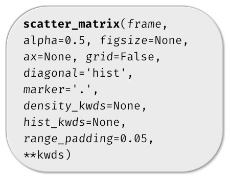
Now, there are, of course, a number of parameters we can use (see image below). In this Pandas scatter matrix tutorial, we are going to use hist_kwds, diagonal, and marker to create pair plots in Python. In the first example, however, we use the simple syntax of the scatter_matrix method (as above).
Data Simulation using Numpy
In this Pandas scatter matrix tutorial, we are going to create fake data to visualize. Here we will use NumPy to create 3 variables (x1, x2, and x3). Specifically, we use the normal method from random:
import numpy as np
import pandas as pd

np.random.seed(134)
N = 1000

x1 = np.random.normal(0, 1, N)
x2 = x1 + np.random.normal(0, 3, N)
x3 = 2 * x1 - x2 + np.random.normal(0, 2, N)
Next step, before visualizing the data we create a Pandas dataframe from a dictionary.
df = pd.DataFrame({'x1':x1,
                   'x2':x2,
                   'x3':x3})

df.head()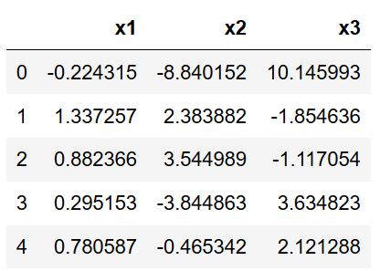
Now, you can see that we have variables x1, x2, and x3 as columns. Normally, we would import data using Pandas read_csv or Pandas read_excel methods, for instance. See the summary, or the linked blog post, on how to do this.
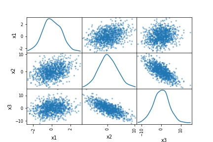
Pandas scatter_matrix (pair plot) Example 1:
In the first Pandas scatter_matrix example, we will only use the created dataframe as input. Now, this will create the following pair plot:
pd.plotting.scatter_matrix(df)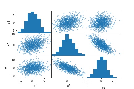
As evident in the scatter matrix above, we are able to produce a relatively complex matrix of scatterplots and histograms using only one single line of code. Now, what does this pairs plot actually contain?
- The diagonal shows the distribution of the three numeric variables of our example data.
- In the other cells of the plot matrix, we have the scatterplots (i.e. correlation plot) of each variable combination of our dataframe. In the middle graphic in the first row we can see the correlation between x1 & x2. Furthermore, in the right graph in the first row we can see the correlation between x1 & x3; and finally, in the left cell in the second row, we can see the correlation between x1 & x2.
In this first example, we just went through the most basic usage of Pandas scatter_matrix method. In the following examples, we are going to modify the pair plot (scatter matrix) a bit…
Pandas scatter_matrix (pair plot) Example 2:
In the second example, on how to use Pandas scatter_matrix method to create a pair plot, we will use the hist_kwd parameter. Now, this parameter takes a Python dictionary as input. For instance, we can change the number of bins, in the histogram, by adding this to the code:
pd.plotting.scatter_matrix(df, hist_kwds={'bins':30})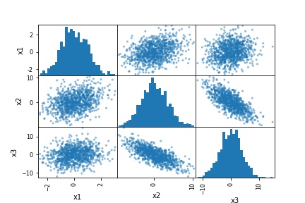
Refer to the documentation of Pandas hist method for more information about keywords that can be used or check the post about how to make a Pandas histogram in Python.
Pandas scatter_matrix (pair plot) Example 3:
Now, in the third Pandas scatter matrix example, we are going to plot a density plot instead of a histogram. This is, also, very easy to accomplish. In the code chunk below, we added the diagonal parameter:
pd.plotting.scatter_matrix(df, diagonal='kde')
That produced a nice scatter matrix (pair plot) with density plots on the diagonal instead of a histogram. Note, that the diagonal parameter takes either “hist” or “kde” as an argument. Thus, if we wanted to have both density and histograms in our scatter matrix, we cannot.
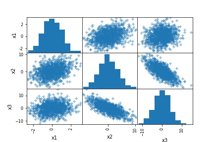
Pandas scatter_matrix (pair plot) Example 4:
In the fourth Pandas scatter_matrix example, we are going to change the marker. This is accomplished by using the marker parameter:
pd.plotting.scatter_matrix(df, marker='+')
Scatter Matrix (pair plot) using other Python Packages
Now, there are some limitations to Pandas scatter_method. One limitation, for instance, is that we cannot plot both a histogram and the density of our data in the same plot. Another limitation is that we cannot group the data. Furthermore, we cannot plot the regression line in the scatter plot. However, if we use the Seaborn and the pairplot() method we can have more control over the scatter matrix. For instance, we can, using Seaborn pairplot() group the data, among other things. Another option is to use Plotly, to create the scatter matrix.
Summary: 3 Simple Steps to Create a Scatter Matrix with Pandas
In this post, we have learned how to create a scatter matrix (pair plot) with Pandas. It was super simple and here are three simple steps to use Pandas scatter_matrix method to create a pair plot:
Step 1: Load the Needed Libraries
In the first step, we will load pandas: import pandas as pd
Step 2: Import the Data to Visualize
In the second step, we will import data from a CSV file using Pandas read_csv method:
csv_file = 'https://vincentarelbundock.github.io/Rdatasets/csv/MASS/survey.csv'
df_s = pd.read_csv(csv_file, index_col=0)

df_s.head()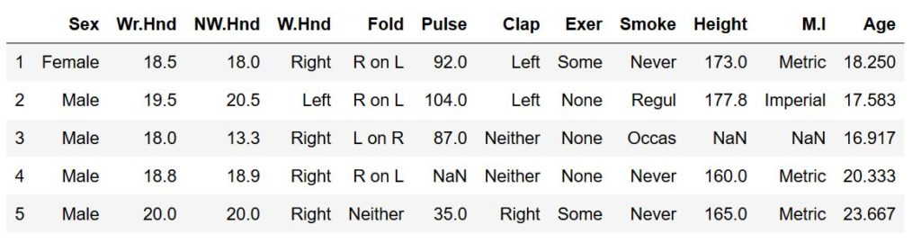
Step 3: Use Pandas scatter_matrix Method to Create the Pair Plot
In the final step, we create the pair plot using Pandas scatter_matrix method. Note, however, that we use Pandas iloc to select certain columns.
pd.plotting.scatter_matrix(df_s.iloc[:, 1:9])
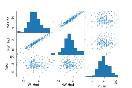
Note, that in the pair plot above, Pandas scatter_matrix only chose the columns that have numerical values (from the ones we selected, of course). Here’s a Jupyter Notebook with all the code in this blog post.

The post How to use Pandas Scatter Matrix (Pair Plot) to Visualize Trends in Data appeared first on Erik Marsja.
from Planet Python
via read more


No comments:
Post a Comment