In my previous article, I explained how the Pandas library can be used for plotting basic and time series plots. While Pandas, Matplotlib, and Seaborn libraries are excellent data plotting libraries, they can only plot static graphs. Static plots are like simple non-interactive images. In most of the cases, static plots are enough to convey the information. However, in some cases you may like to add user interactivity to your plots.
In this article, we will see how the Python's Plotly library can be used to plot interactive plots. We will plot geographical data using plotly and will explain how user can interact with such plots.
Installing Required Libraries
To install the Plotly library using the "pip" utility, you need to execute the following command:
$ pip install plotly
In addition to Plotly, we will also use Cufflinks, which works as a connector between the Pandas library and Plotly, and helps us plot interactive graphs directly using a Pandas dataframe.
To install Cufflinks using pip, execute the following script:
$ pip install cufflinks
Importing Required Libraries
Plotly is basically an online library that hosts your data visualizations, however, it also provides an offline data package that can be used to draw interactive plots offline.
Before we can run Plotly in Jupyter notebook, which I am using to run my scripts, I need to import both the Plotly and Cufflinks libraries along with Numpy and Pandas as usual.
The following script imports the Numpy and Pandas libraries:
import pandas as pd
import numpy as np
%matplotlib inline
Next, we need to import the offline versions of the Plotly modules that we will be using in this article. The following script does that:
from plotly.offline import download_plotlyjs, init_notebook_mode, plot, iplot
Before we can execute our scripts, we need to connect the JavaScript to our notebook. Since Plotly plots are interactive, they make use of JavaScript behind the scenes. The scripts that we are going to run will be executed in the Jupyter notebook. To connect Jupyter notebook with JavaScript, we need to execute the following script:
init_notebook_mode(connected=True)
Finally, we need to import the Cufflink library and make sure that we will be using it offline. To do so, run the following script:
cf.go_offline()
Now we have everything that we need to draw interactive Plotly graphs inside our Jupyter notebooks.
Plotly for Basic Plots
In this section, we will be using the Plotly library to draw basic interactive plots. In the next section, we will see how Plotly can be used to plot geographical data.
The Dataset
The dataset that we are going to use for this section is the "Tips" dataset that is downloaded by default with the Seaborn library. The dataset contains information about the amount spent by a group of people at lunch and dinner. The dataset contains gender, price, tips, age, size, day, time and whether the people who had lunch or dinner were smokers or not.
The following script imports the dataset and displays the first five rows of the dataset:
import seaborn as sns

dataset = sns.load_dataset('tips')

dataset.head()
The output of the script looks like this:
From the output, you can see that our dataset contains three numerical columns: total_bill, tip, and size and four categorical columns: sex, smoker, day, and time.
Before using Plotly to draw interactive plots, let's remind ourselves how we used Pandas for plotting static graphs. Let's call the plot() method on our dataframe to see how Pandas plot static plots. We will plot the values for the 'total_bill', 'tip', and 'sex' columns. Look at the following script:
dataset2 = dataset[["total_bill", "tip", "size"]]
dataset2.plot()
You can see that to plot a graph, we simply called the plot method on our dataframe.
Output:
From the output, you can see the static line plot for the 'total_bill' and 'tips' column.
Now let's see how we can draw interactive plots using Plotly. In the section where we imported the libraries, we import the plot() function from the plotly.offline module. To plot interactive plots using Pandas dataframe, we simply need to call the iplot() method instead of the plot method. Take a look at the following example:
dataset2.iplot()
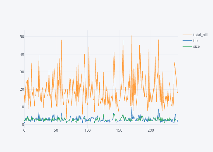
Once you execute the above script, you should see an interactive line plot for the total_bill, tip and sex columns as shown below:
If you hover over the plot you should see values changing. You can zoom in and zoom out of the plot using the options available at the top right corner of the plot. You can also add and remove columns from the plot. Finally, you can also save the graph as a static image.
In the rest of the section, we will plot some of the most commonly used interactive plots using Plotly.
The Bar Plot
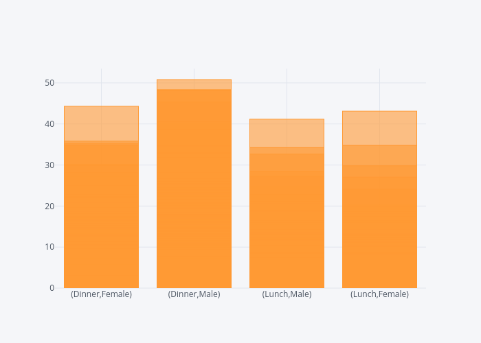
To plot the interactive bar plot using Plotly, you can use the iplot() function. You need to pass "bar" as the value for the kind parameter of the iplot() function. Furthermore, you need to pass the list of the categorical columns for which you want to plot your graphs to the x attribute. Finally, the numerical column is passed as a value to the y attribute. The following script plots a bar plot for the time and sex columns on the x-axis and total_bill on the y-axis.
dataset.iplot(kind='bar', x=['time', 'sex'],y='total_bill')
Output:
You can see from the output that four bars have been plotted for the total bill. The bars show all possible combinations of values in the sex and time columns.
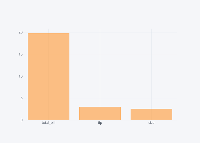
In addition to specifying columns for the bar plots, you can simply call an aggregate function on the Pandas dataframe and then call the iplot() function and pass "bar" as the value for kind attribute. This will plot the bar for every numerical column according to the aggregate function. For instance, if you want to plot the bar plot containing the average values for total_bill, tip and size column, you can use the following script:
dataset.mean().iplot(kind='bar')
Output:
In the output, you can see the bar plots with mean values for total_bill, tip and size column.
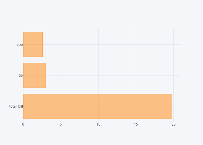
In addition to vertical bar plots, you can also plot horizontal bar plots. All you have to do is to pass "barh" as an attribute to the kind parameter, as shown in the following script:
dataset.mean().iplot(kind='barh')
Output:
In the output, you can see the horizontal bar plots for the mean values of total_bill, tip and size columns.
The Scatter Plot
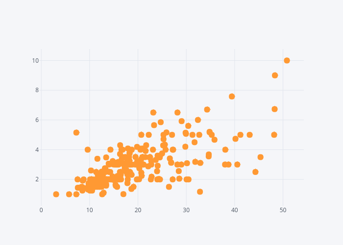
To plot an interactive scatter plot, you need to pass "scatter" as the value for the kind parameter of the iplot() function. Furthermore, you need to pass column names for the x and y-axis. The following script plots a scatter plot for the total_bill column on the x-axis and tip column in the y-axis.
dataset.iplot(kind='scatter', x='total_bill', y='tip', mode='markers')
Output:
Hover your mouse over the interactive plot to see the changing values for total_bill and tip columns.
The Box Plot
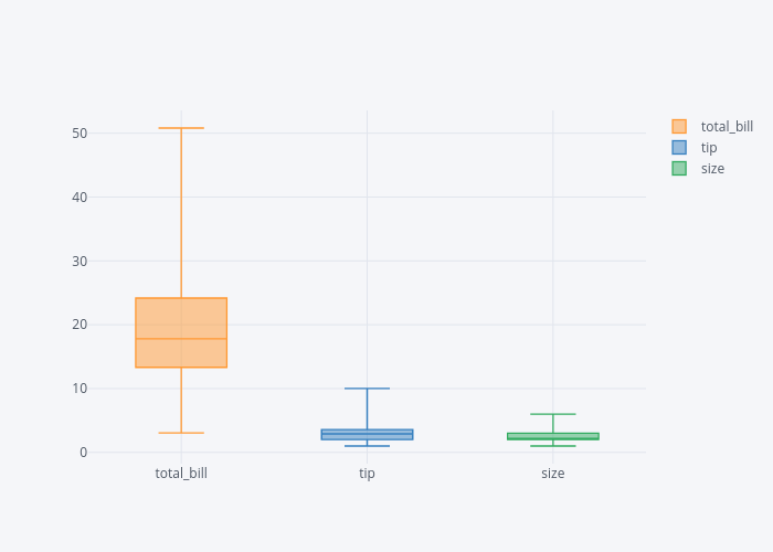
In one of my earlier articles I explained what is a box plot and how we can draw it using the Seaborn library. The box plot plots the quartile information for the numerical columns. The distance between the bottom whisker and the bottom of the box displays the first quartile. The distance between the bottom of the box to the middle of the box displays the second quartile. Similarly, the distance from the middle of the box to the upper end of the box quantifies the third quartile while the distance from the top of the box to the top whisker displays the last quartile.
Using Plotly, you can draw interactive box plots. All you have to do is pass the box as value to the kind parameter of the iplot() function as shown below:
dataset2.iplot(kind='box')
In the output, you will see box plots for all the numerical columns in the data i.e. total_bill, tip and size.
Output:
The Hist Plot
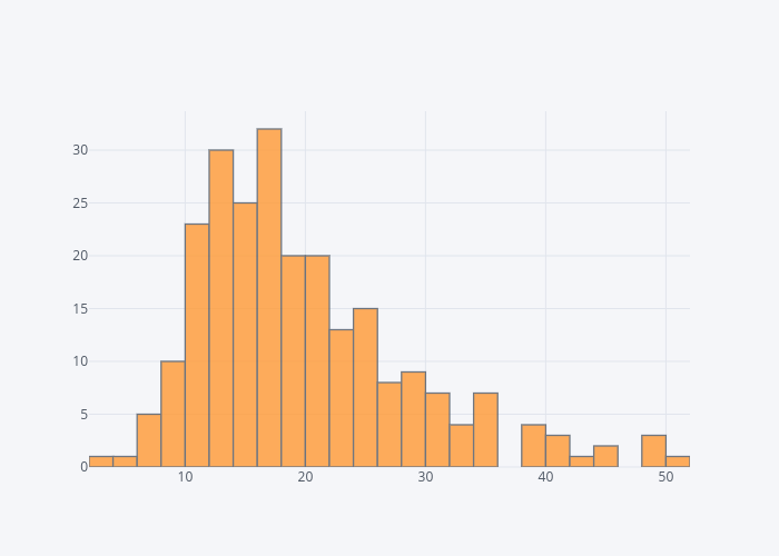
The Plotly library can also be used to plot interactive histogram plots for any column in the dataset. To do so, you have to pass "hist" as value to the kind parameter of the iplot() function. You can also specify the number of bins using the bins attribute. The following script plots histogram for the total_bill column:
dataset['total_bill'].iplot(kind='hist',bins=25)
Output:
The Scatter Matrix Plot
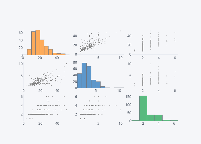
The scatter matrix plot is basically a set of all the scatter plots for numeric columns in your dataset.
dataset2.scatter_matrix()
The Spread Plot
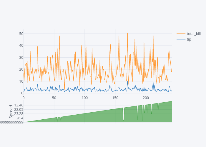
The spread plot shows the spread between two or more than numerical columns at any particular point. For instance, to see the spread between total_bil and tip, you can use the spread function as follows:
dataset[['total_bill','tip']].iplot(kind='spread')
Output:
From the output, you can see that as the total_bill increases, the spread between the total_bill and tip also increases.
3D Plots
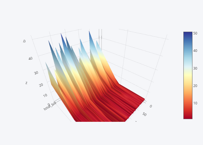
Finally, in addition to 2D plots, you can also create 3-D interactive plots using Plotly library. For instance to see 3D plot for total_bill, tip and size columns, execute the following script.
dataset2 = dataset[["total_bill", "tip", "size"]]
data = dataset2.iplot(kind='surface', colorscale='rdylbu')
In the output you can see 3D plot, you can move, turn it around, and zoom in and zoom out of the plot.
Output:
In this section, we saw some of the most commonly used interactive plots offered Plotly. In the next section, we will see how Plotly library can be used to plot geographical data.
Plotly for Geographical Plots
To draw geographical plots with Plotly, we will use Choropleth Maps. Choropleth Maps are special types of Plotly plots that are used to plot geographical data. The detailed documentation regarding how to use the choropleth maps is available here.
In this section we will see, with the help of examples, how to draw geographical maps for United States as well as for the whole world. But before we actually write the code to plot the geographical plots, let's first import the desired libraries.
import plotly.plotly as py
import plotly.graph_objs as go
from plotly.offline import download_plotlyjs, init_notebook_mode, plot, iplot

init_notebook_mode(connected=True)
import pandas as pd
Geographical Maps for the United States
There are four steps to drawing geographical maps using the Plotly.
Step 1: Create a Data Dictionary
The first step is to create a data dictionary that actually contains the data that you want to display on the map. To do this, execute the following script, which I will explain line by line after that.
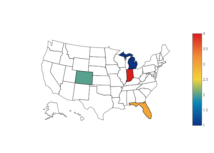
map_data = dict(type='choropleth',
            locations=['MI', 'CO', 'FL', 'IN'],
            locationmode='USA-states',
            colorscale='Portland',
            text=['Michigan', 'Colorado', 'Florida', 'Indiana'],
            z=[1.0,2.0,3.0,4.0],
            colorbar=dict(title="USA States")
           )
You need to specify values for several keys in the data dictionary. They are as follows:
type: Since we are using choropleth maps, the type will always bechoropleth.locations: Here we need to pass the abbreviations for the states that we want to display on our map. Four states will be displayed on our map: 'Michigan (MI)', 'Colorado (CO)', 'Florida (FL), 'Indiana (IN)'locationmodewill beUSA-statesince we are only displaying the map for the United States.colorscale: This key is used to specify the color of the plot. Check the documentation for more color options.text: Contains a list of strings that will be displayed when the mouse hovers over the state location.- The
zkey contains a list of numerical values that will be displayed when the mouse hovers over the state location. colorbaris a dictionary. For thetitlekey, you can specify the text that will be displayed on the color bar.
Step 2: Create a Layout
Once, you have created a data dictionary, the next step is to create the layout dictionary. The layout dictionary for USA is simple as shown in the following script.
map_layout = dict(geo = {'scope':'usa'})
The dictionary takes another dictionary named geo. We passed the value "usa" for the scope key since our map is only limited to USA.
Step 3: Create Graph Object
If you look at the section where we imported the libraries, we imported the plotly.graph_objs class. The third step is to create an object of this graph. To do so we need to call the Figure function from the object. The object takes two parameters: data and layout. We will pass our data dictionary to the first parameter and the layout dictionary to the second parameter, as shown below:
map_actual = go.Figure(data=[map_data], layout=map_layout)
Step 4: Call iplot() Method
The final step is to call the iplot() function and pass it the graph object that we created in the third step as shown below:
iplot(map_actual)
In the output, you will see the geographical plot for four US states. You can see that the rest of the state have not been colored since we did not specify any information regarding those states. If you hover the mouse over the colored states, you will see the corresponding values of the text and z keys that we specified when we created our data dictionary.
Geographical Maps for the United States Using CSV
Now we have a basic idea of how we can create geographical plots using Plotly and choropleth maps. Let us now create a more complex map. We will see how we can use data from a CSV file to create a geographical plot. We will create a geographical map that will display the Per Capita GDP for all the states in the United States.
The Dataset
The dataset for this section can be downloaded from this Kaggle Link, which comes in a CSV format. I have changed the name of the file for readability purposes.
The following script imports the dataset and prints its first five rows to the console.
df = pd.read_csv(r'E:/state_gdp.csv')
df.head()
The output looks like this:
The dataset contains the names of the states in USA in the Area column. The dataset also contains the Per Capita GDP for the five years from 2013 to 2017. We will plot the data for the year 2017.
One problem with the dataset is that it contains full names of the states, while the choropleth maps accept the abbreviation for the state names. The first thing that we need to do is to add a column to our dataset that contains the abbreviations for the state names.
One way to do this is to create a dictionary for the state names and their abbreviations and then later create a column that contains abbreviated values from that dictionary. The following script creates a dictionary where the keys are the full state names and the values are the corresponding state abbreviations:
us_state_abbrev = {
    'Alabama': 'AL',
    'Alaska': 'AK',
    'Arizona': 'AZ',
    'Arkansas': 'AR',
    'California': 'CA',
    'Colorado': 'CO',
    'Connecticut': 'CT',
    'Delaware': 'DE',
    'Florida': 'FL',
    'Georgia': 'GA',
    'Hawaii': 'HI',
    'Idaho': 'ID',
    'Illinois': 'IL',
    'Indiana': 'IN',
    'Iowa': 'IA',
    'Kansas': 'KS',
    'Kentucky': 'KY',
    'Louisiana': 'LA',
    'Maine': 'ME',
    'Maryland': 'MD',
    'Massachusetts': 'MA',
    'Michigan': 'MI',
    'Minnesota': 'MN',
    'Mississippi': 'MS',
    'Missouri': 'MO',
    'Montana': 'MT',
    'Nebraska': 'NE',
    'Nevada': 'NV',
    'New Hampshire': 'NH',
    'New Jersey': 'NJ',
    'New Mexico': 'NM',
    'New York': 'NY',
    'North Carolina': 'NC',
    'North Dakota': 'ND',
    'Ohio': 'OH',
    'Oklahoma': 'OK',
    'Oregon': 'OR',
    'Pennsylvania': 'PA',
    'Rhode Island': 'RI',
    'South Carolina': 'SC',
    'South Dakota': 'SD',
    'Tennessee': 'TN',
    'Texas': 'TX',
    'Utah': 'UT',
    'Vermont': 'VT',
    'Virginia': 'VA',
    'Washington': 'WA',
    'West Virginia': 'WV',
    'Wisconsin': 'WI',
    'Wyoming': 'WY',
}
The next step is to add a column in the dataset that contains abbreviations. We can do so by mapping the values in the Area column to the keys in the us_state_abbrev dictionary. The corresponding values can then be added to the newly created abbreviation column as shown below:
df['abbrev'] = df['Area'].map(us_state_abbrev)
Now if you again print the top of the dataframe using the head() function, you will see the newly created abbrev column, as shown below:
df.head()
The output looks like this:
You can see the state abbreviations in the abbrev column. It is important to mention that the Area column has values for the whole country as well. However, the country will have a corresponding abbreviation of NaN in the abbrev column, and therefore will be ignored when you plot the graph.
Now that we have preprocessed our data, the next steps are straight forward. First, we will create a data dictionary containing values from our dataset, as shown below:
map_data = dict(type='choropleth',
            locations=df['abbrev'],
            locationmode='USA-states',
            colorscale='Reds',
            text=df['Area'],
            marker=dict(line=dict(color='rgb(255,0,0)', width=2)),
            z=df['2017'],
            colorbar=dict(title="GDP Per Capita - 2017")
           )
You can see that in the above script, for the locations key we are passing the abbrev column of our dataset. This means that the geographical plot for all the states in the United States will be printed on the screen.
Similarly, for the text key we are passing the "Area" column that contains the full name of the state. Finally, for the z key, we pass the Per capita GDP for the year 2017.
It is also important to mention that we have a new key here i.e. marker. This is used to create a border between different states. An RGB value of 255,0,0 means that the border will be red. A width of 2 specifies the width of the border is 2 pixels.
The next step is to create the layout for our map. The following script does that:
map_layout = dict(title='USA States GDP Per Capita - 2017',
              geo=dict(scope='usa',
                         showlakes=True,
                         lakecolor='rgb(85,173,240)')
             )
Notice that in the script above we pass True for the showlakes key, which means that the lakes will be displayed on the map and their color will be light blue as specified by the RGB value of rgb(85,173,240).
Finally, you need to create the graph object and pass it the data and layout dictionaries, as we did in the last section. Look at the following script:
map_actual = go.Figure(data=[map_data], layout=map_layout)
As the last step, we need to call the iplot() method and pass it our newly created graph object:
iplot(map_actual)
Once you execute the above script, you will see a map of United States with per capita GDP. The states lighter in color have lesser GDP than the ones darker in color.
Geographical Maps for the World
In the previous sections, we saw graphical maps for the United States. In this section, we will see how to plot geographical maps for the world. The process remains more or less similar. As a first step, we will create a data dictionary, followed by the layout dictionary and the graph object. Finally, we will use the iplot() function to plot the graph.
The Dataset
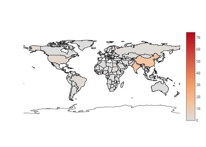
The dataset that we are going to use contains a country-wise population of the world for the years 1960-2016. We will be plotting a geographical map of the world displaying the population for each country for the year 2016.
The dataset can be downloaded from this Kaggle link. The dataset will be downloaded in the CSV format.
The following script imports the dataset and displays its first five rows using the head() method.
df = pd.read_csv(r'E:/world_pop.csv')
df.head()
The following image contains screenshot of the output:
Let's create a data dictionary that will store the information about the data that we want to plot from the population dataset that we just loaded.
map_data = dict(
        type='choropleth',
        locations=df['Country Code'],
        z=df['2016'],
        text=df['Country'],
        colorbar={'title': 'World Population 2016'},
      )
From the script above, you can see that the only change that we made is in the locations key; now we are passing the "Country Code" instead of the abbreviations for the state. This is a mandatory requirement for plotting the geographical plot of the world. For the text key, we pass the values from the "Country" column that contains the full name of the country. Similarly, for the z key, we pass the values from column "2016" because this is the column that contains the population values for the year 2016.
The next step is to create a layout dictionary. Look at the following script:
map_layout = dict(
    title='World Population 2016',
    geo=dict(showframe=False)
)
In the layout, the only parameter that we change is the showFrame key for the geo dictionary. If this key is set to False, the resultant plot does not contain a boundary.
Next, we need to create a Plotly graph object and pass it both the data and the layout dictionaries that we created, as shown below:
map_actual = go.Figure(data=[map_data], layout=map_layout)
As the last step, we need to call the iplot() function and pass it the graph object that we just created.
The output should look like this:
In the output, you can see the map of the whole world along with the population densities. You can see that the map for India and China is darker compared to the other countries since they are much more populated compared to European countries that are less populated. If you hover the mouse over any country, you should see the name of the country along with the total population.
Conclusion
Plotly is an extremely useful Python library for interactive data visualization. In this article, we saw how we can use Plotly to plot basic graphs such as scatter plots, line plots, histograms, and basic 3-D plots. We also saw how Plotly can be used to plot geographical plots using the choropleth map. As an example, we plot geographical plots for the United State as well as for the whole world.
I would suggest that you explore the choropleth library and try to practice creating some more geographical plots, as there are a lot of features to explore. The detailed documentation for choropleth maps is available at this link: https://plot.ly/python/choropleth-maps/.
from Planet Python
via read more





No comments:
Post a Comment